9. Real Example Analysis
![]()
Overview
Questions
- How do you visualize data from a
DataFrame? - How do you group data by year and month?
- How do you plot multiple measurements in a single plot?
Objectives
- Learn how to plot the cleaned data.
- Learn how to subset and plot the data.
- Learn how to use the groupby method to visualize yearly and monthly changes.
Analyzing Real Data
This episode continues from the previous one and utilizes the final DataFrame described there.
Analysis
Before we get started on our analysis let us take stock of how much data we have for the various columns. To do this we can use two DataFrame methods that we’ve previously used.
First, we can check how many rows of data we have in total. We can check this easily through the shape attribute of the DataFrame
Python
df.shape
Output
(21222, 13)
From this, we can see that we have 21222 rows in our data and 13 columns. At most, we can have 21222 rows of data for each column. However, as we saw during the cleaning phase there are NaN values in our dataset so many of our columns won’t contain data in every row.
To check how many rows of data we have for each column we can again use the describe() method. It will count how many rows of data are not NaN for each column. To reduce the size of the output we will use loc to only view the counts for each column.
Python
df.describe().loc["count",:]
Output
time hhmmss       21222.0
press dbar        21222.0
temp ITS-90       21222.0
csal PSS-78       21210.0
coxy umol/kg       3727.0
ph                  885.0
phos umol/kg       2259.0
nit umol/kg        2253.0
doc umol/kg         868.0
hbact #*1e5/ml      750.0
pbact #*1e5/ml      749.0
sbact #*1e5/ml      750.0
Name: count, dtype: float64
As we can see we have highly variable amounts of data for each of our columns. We will ignore pressure since it is roughly a depth estimate. These fit fairly neatly into three groups:
- Data that is found in almost all rows
- Temperature
- Salinity
- Data that is found in around 2000-4000 samples
- Oxygen
- Phosphorus
- Nitrate+Nitrite
- Data that is found in fewer than 1000 samples
- pH
- Dissolved organic carbon
- Heterotrophic bacteria
- Prochlorococcus
- Synechococcus
Note here that pressure is roughly akin to “depth” so we won’t be using it.
GroupBy and Visualization
To start off we can focus on the measurements that we have plenty of data for.
Exercise: Plotting Temperature
We can quickly get a matplotlib visualization for temperature by calling the plot method from our DataFrame. We can tell it what columns we want to use as the x axis and y-axis via the parameters x and y. The kind parameter lets the plot() method know what kind of plot we want e.g. line or scatter. For more information about the plot function check out the docs (Link to plot method docs).
Python
df.plot(x="date", y="temp ITS-90", kind="line")
Solution
Below is the output plot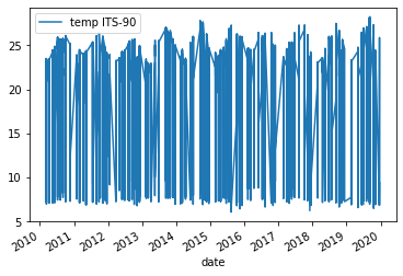
The resulting plot appears cluttered. Notable yearly temperature fluctuate between 7°C and 25°C and the lines are densely packed.
Exercise: Plotting Surface Temperature
This cluttered plot results, in part, from all high variance of the temperature values in our dataset, regardless of depth (i.e. pressure). To resolve some of the variation we can ask Pandas to only plot data that is from roughly the top 100m of the water column this would be roughly any rows that come from pressures of less than 100 dbar.
Python
surface_samples = df[df["press dbar"] < 100]
surface_samples.plot(x="date", y="temp ITS-90", kind="line")
Solution
Below is the output plot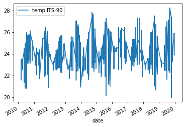
Now we can see that we have removed some of the variation we saw in the previous figure. However, it is still somewhat difficult to make out any trends in the data. One way of dealing with this would be to e.g. get the average temperature for each year and then plot those results.
To this end, we will introduce a new method called groupby which allows us to run calculations like mean() on groups we specify. We want to get the mean temperature for each year. Thanks to our previous work in setting up the date column type this is very easy. We can also reuse surface_samples to only get samples from the upper 100m of the water column.
Python
grouped_surface_samples = surface_samples.groupby(df.date.dt.year).mean()
Output
| press dbar | temp ITS-90 | csal PSS-78 | coxy umol/kg | ph | phos umol/kg | nit umol/kg | doc umol/kg | hbact #*1e5/ml | pbact #*1e5/ml | sbact #*1e5/ml | |
|---|---|---|---|---|---|---|---|---|---|---|---|
| date | |||||||||||
| 2010 | 37.517 | 24.4383 | 35.2826 | 213.306 | 8.06385 | 0.0758416 | 0.0334653 | 73.8102 | 4.61495 | 1.90935 | 0.0143514 |
| 2011 | 40.0254 | 24.546 | 35.2255 | 210.138 | 8.07209 | 0.0564545 | 0.0294643 | 74.384 | 4.6512 | 1.78386 | 0.0193878 |
| 2012 | 37.5037 | 24.2862 | 35.2003 | 211.909 | 8.06153 | 0.114953 | 0.0182243 | 72.5789 | 4.78708 | 1.96827 | 0.0153514 |
| 2013 | 38.5446 | 24.4499 | 35.3025 | 211.057 | 8.06493 | 0.0872642 | 0.0269811 | 71.5484 | 4.778 | 2.34522 | 0.0201622 |
| 2014 | 40.7634 | 24.7555 | 35.2871 | 211.539 | 8.06979 | 0.0659829 | 0.0256522 | 72.2371 | 4.84544 | 2.22315 | 0.0189268 |
| 2015 | 37.9309 | 24.7992 | 35.2105 | 210.16 | 8.06583 | 0.0717949 | 0.0292105 | 70.8942 | 4.83866 | 2.18234 | 0.0183864 |
| 2016 | 37.8143 | 24.9402 | 34.9958 | 208.771 | 8.07224 | 0.0681081 | 0.0556757 | 72.5621 | 4.46732 | 2.12753 | 0.0144706 |
| 2017 | 36.4994 | 24.8369 | 35.001 | 211.144 | 8.06492 | 0.0529464 | 0.0335135 | 70.5569 | 4.74498 | 2.10988 | 0.0199268 |
| 2018 | 37.0647 | 24.5807 | 34.9996 | 213.029 | 8.05466 | 0.06 | 0.08525 | nan | 4.55555 | 2.03562 | 0.0207105 |
| 2019 | 38.4616 | 25.0876 | 34.8056 | 212.239 | 8.06179 | 0.0600935 | 0.0216667 | nan | 5.08483 | 2.12312 | 0.0152143 |
We see now that the new DataFrame generated by groupby() and mean() contains the mean for each year for each of our columns.
Exercise: Plotting Yearly Surface Temperature
Now we can just run the same plot method as previously but using grouped_surface_samples instead of surface_samples.
Python
grouped_surface_samples = surface_samples.groupby(df.date.dt.year).mean()
Solution
Below is the output plot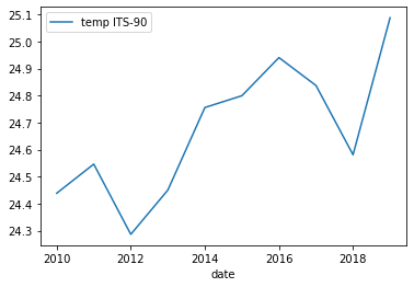
Now it looks a lot smoother, but now we have another issue. We’ve smoothed out any month-to-month variations that are present in the data. To fix this we can instead use the groupby method to group by year and month.
Python
grouped_surface_samples = surface_samples.groupby([(surface_samples.date.dt.year),(surface_samples.date.dt.month)]).mean()
Exercise: Plotting Monthly Surface Temperature
If we plot this we get a month-by-month plot of temperature variations.
Python
grouped_surface_samples.plot(y="temp ITS-90", kind="line")
Solution
Below is the output plot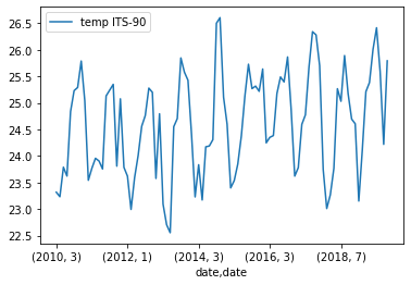
While we have been focusing on temperature there is no reason that we can’t redo the same plots that we have been making with measurements other than temperature. We can also plot multiple measurements at the same time if we want to as well.
Exercise: Plotting Monthly Surface Temperature
To test this we will try plotting the abundance of Prochlorococcus, Synechococcus, and heterotrophic bacteria.
Python
grouped_surface_samples.plot(y=["hbact #*1e5/ml", "pbact #*1e5/ml",
                                "sbact #*1e5/ml"], kind="line")
Solution
Below is the output plot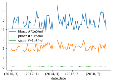
We explored various methods of plotting our data. We’ve also learned how to group different measurements depending on when the measurement was taken. If you are interested you can keep testing different methods of grouping the data or plotting some of the measurements that we did not use e.g. pH or dissolved organic carbon (doc umol/kg).
Key Points
- Grouping data by year and months is a powerful way to identify monthly and yearly changes.
- You can easily add more measurements to a single plot by using a list.
For more information
There is a lot we didn’t cover in this workshop. To go further, take a look at the Matplotlib docs (Link to Matplotlib docs) and other libraries that can allow you to make dynamic plots e.g. Plotly (Link to Plotly docs)