2. Design Principles for Visualizations
Objectives
- Give you an overview of design principles for visualization.
- Examples of well desinged visuals.
The data visualization pipeline involves key actions to import, filter, map, and render the representations of the mapped data.
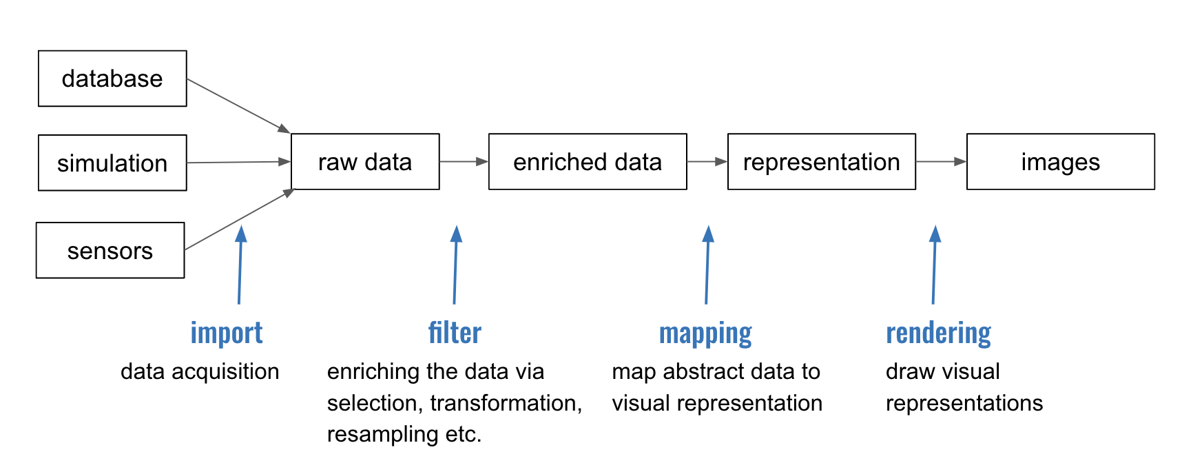
You’ve spent time with data manipulation, but what is data mapping (in the context of visualization)? This is also known as visual encoding.
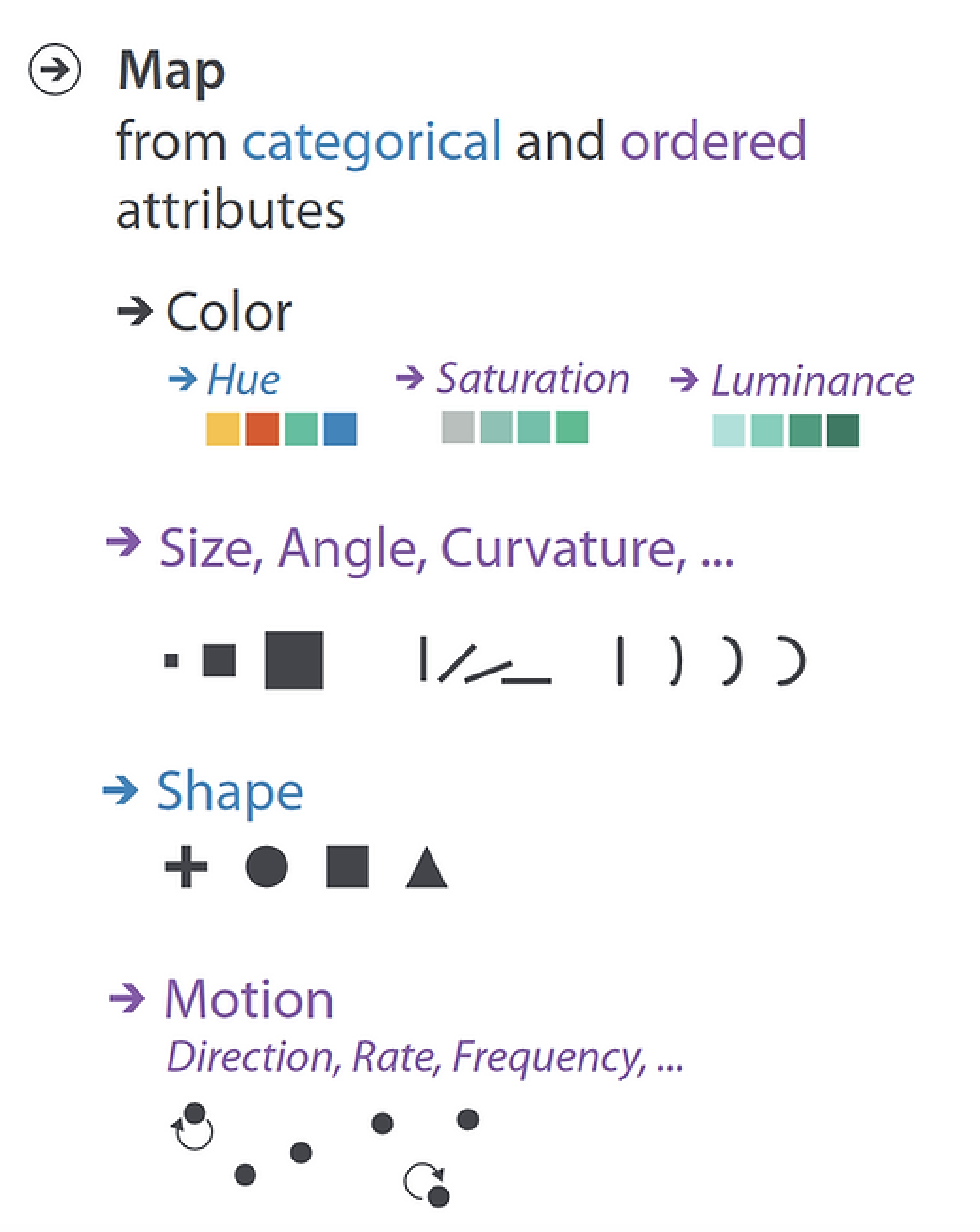
Image from “Visualization Analysis and Design” by Tamara Munzner
There are many guidelines for choosing visual encoding for data attributes. For example, in the image above we see that some encoding is better for categorical data (in this case, hue and shape) and other encoding is better for ordered data (in this case, saturation, luminance, size, angle, curvature, and motion).
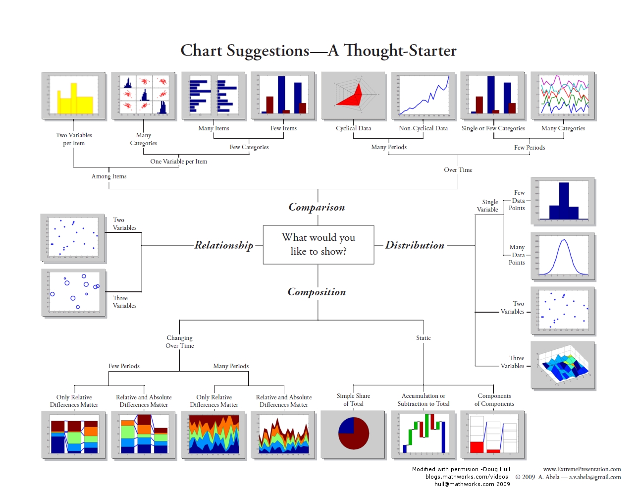
If you are working on creating a visualization and are not sure what kind of encoding to use, there are many resources available - charts that will help you choose an encoding based on the type of data you have and the purpose of the visualization. Look, for example, at the Abela Chart Chooser. It starts with a question “what do you want to show?” with the options of comparison, relationship, distribution, and composition. When this direction is selected, it provides example charts based on the nature of the data.
You can easily find other resources online that provide galleries of existing charts.
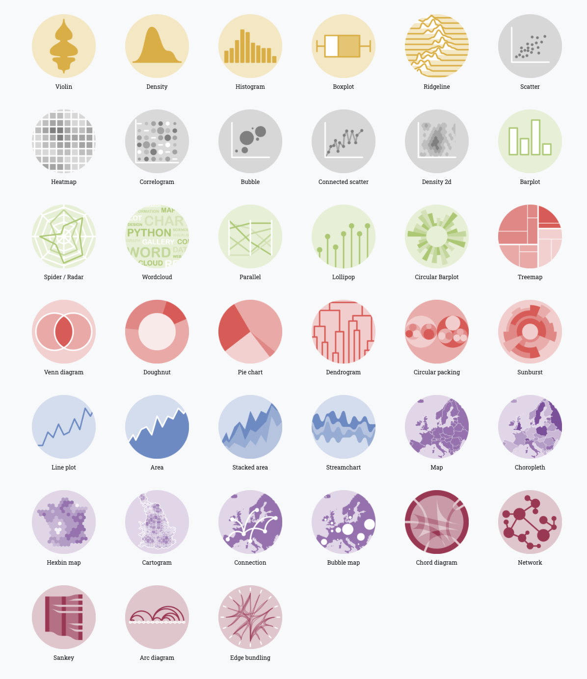
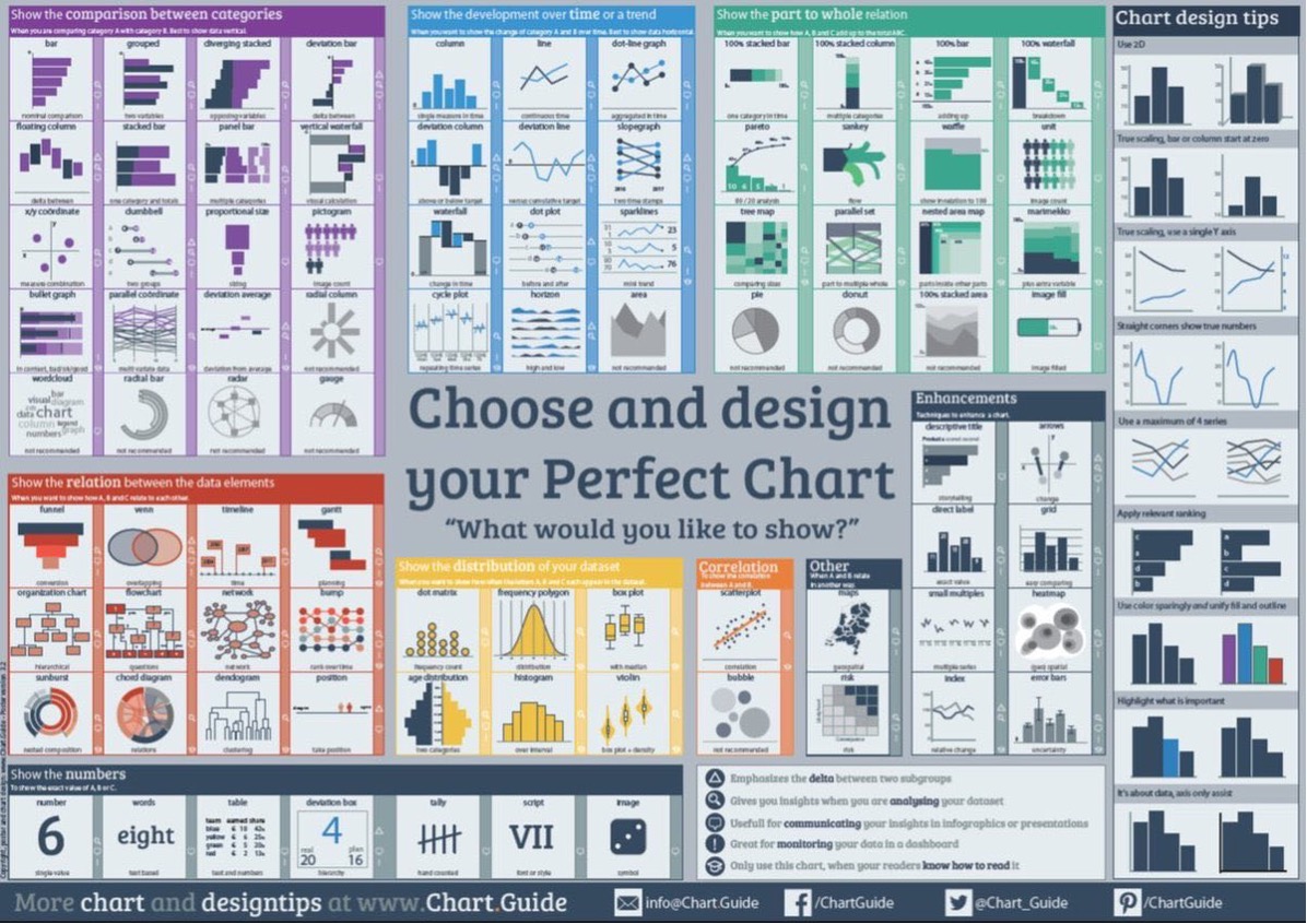
(See, for example, data-to-viz and chart guide)
But, we need to note that even if a visual encoding is suitable for your data and purpose, it is not always the best possibility. This is often the case with pie charts. People use pie charts to showcase data as percentages out of a whole. But pie charts are only good for comparing 2 to 3 different data points whose values are very different. They are poor for comparing between arbitrary segments.
Consider the following example. Let’s say the following 3 pie charts show the votes for 5 candidates in 3 polling stations. Notice how the orientation of the pie wedges make them difficult to compare between the 5 candidates.
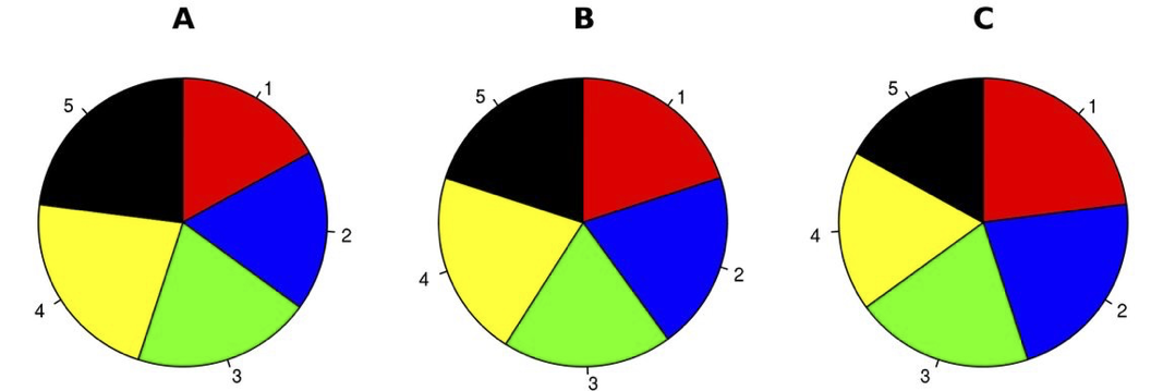
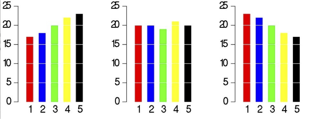
But when we look at the same data when simply plotted on bar charts, the differences between the candidates and polling stations are instantly apparent.
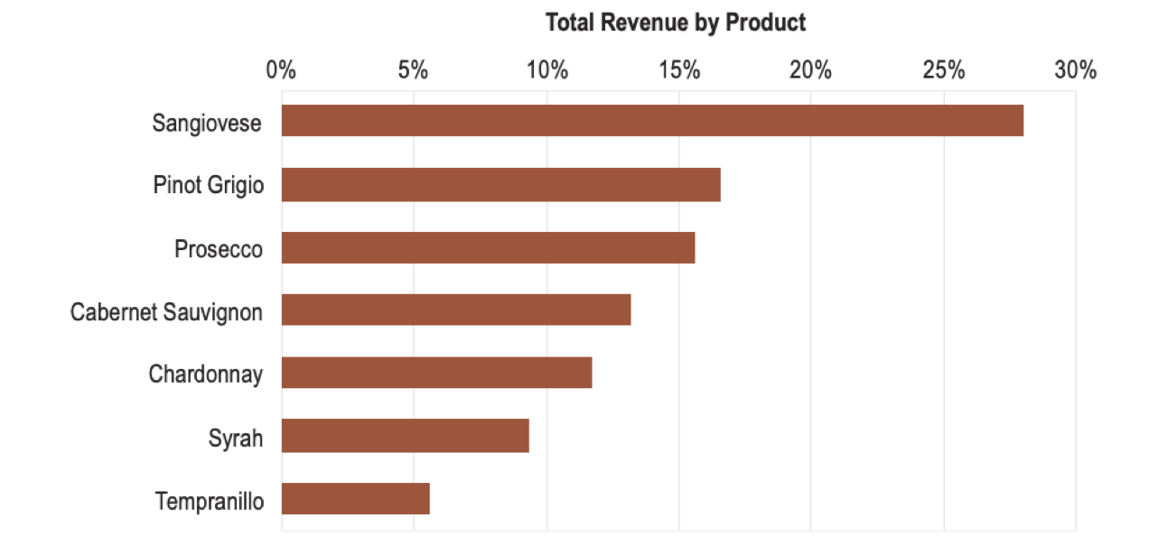
Likewise, if you look at the following chart, how much bigger is Pinot Grigio than Tempranillo?
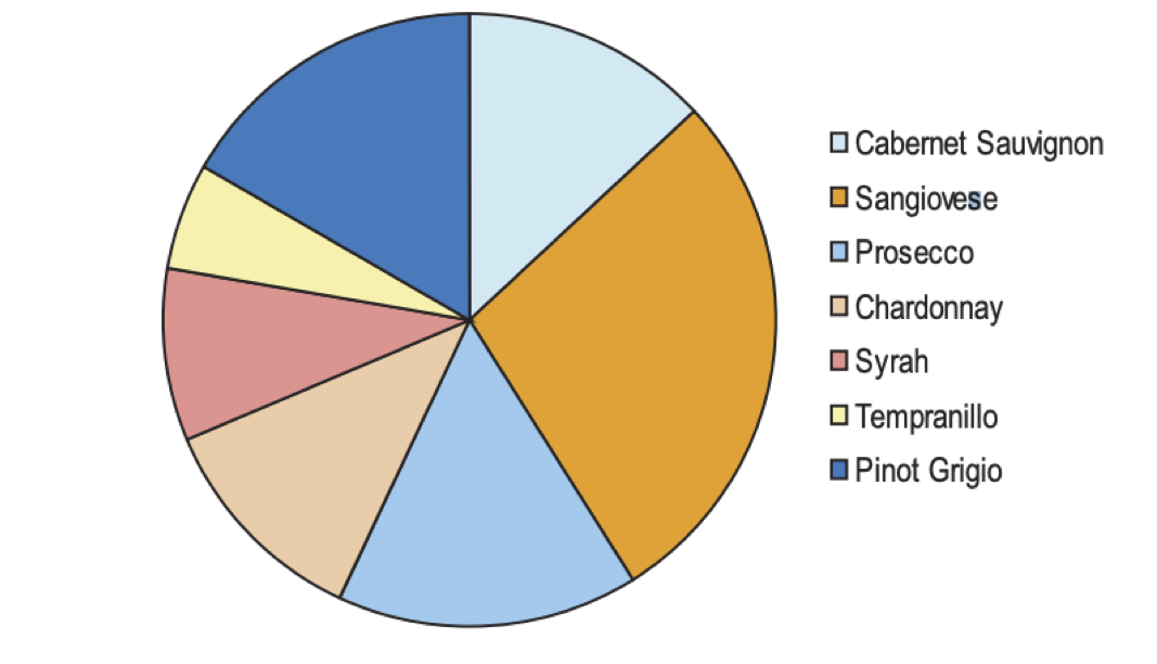
Notice that to answer my question your eyes have to move to the legend then find the corresponding pie slice in the chart. Then you had to try and compare the size of the slices accounting for their differing orientation.
The estimation is easier when using a simple bar chart (it is about 3 times bigger).
The ideas behind selecting visual encoding are based on experimentation into human perception. In this form of research, scientists measure the processes that happen in the human vision system as well as human memory. So let’s look at that briefly.
The figure below (from Alberto Cairo’s “The Functional Art”) depicts how your brain processes visual information.
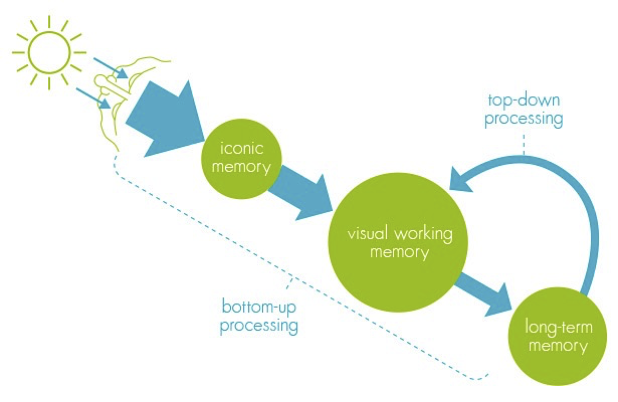
When your brain sees a visualization, it is stored in “Iconic Memory”. Iconic Memory is a short-term buffer and processor to maintain a coherent picture of the world at all times. It also perceives basic visual attributes like shape, edges, relative size, patches of color. These visual attributes are also referred to as Pre-Attentive attributes. It means you don’t have to think hard to see them. If you know what the brain pre-attentively processes, you can use that to make important data in your visualizations stand out to the user.
Iconic memory’s information is passed to visual working memory. Visual working memory is also a short-term storage (stores about 5 +/- 2 things at a time). Lastly, long-term memory kicks in to associate things in short-term memory to enable comprehension of what you are seeing.
Therefore, a good visualization is likely to:
- take advantage of pre-attentive visual attributes to make important features in the data stand out.
- not require visual working memory to hold more than 5 +/- 2 things at a time. (i.e. you don’t want the user to have to refer to more than 5 encodings to make sense of something)
- associate it with something that the user might be familiar with from past experience (i.e. relate the data to something from their long term memory).
For example, consider this visualization meant to show that a wind turbine is 853 ft tall.
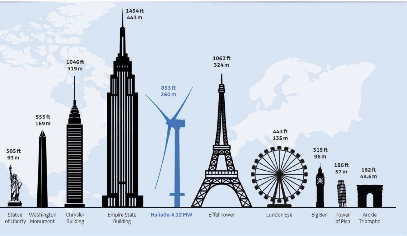
It uses the pre-attentive color attribute to draw your attention to the wind turbine, it compares it to other known structures like the Statue of Liberty, or the Empire State Building, you only need to grasp the turbine in comparison to a handful of the other items to “get” the story (you only look at about 5 of these at a time).
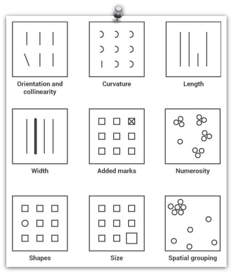
Pre-attentive visual attributes - are those that are processed in sensory memory without our conscious thought. It takes our brain less than half a second to process a pre-attentive property of an image. Four basic visual properties that can be defined as pre-attentive include: Form, Movement, Spatial Positioning and Color.
Examples of Form include: orientation, curvature, length, width, added marks, numerosity, shapes, size, and spatial grouping.
Examples of movement include: Flicker, Velocity, Direction.

Examples of Spatial Positioning include:
- 2D positioning – plotting something on a 2D map;
- Stereoscopic depth - seeing depth by virtue of the fact that we have 2 eyes. As it turns out depth perception is the most rapidly detected preattentive stimulus;
- Concave and convex positioning – being able to see whether something is concave or convex.

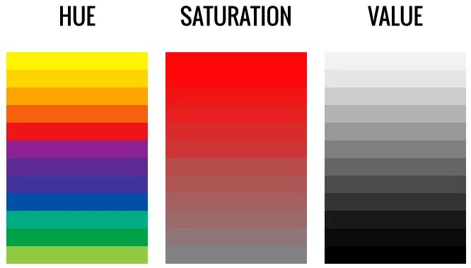
We often use the word Color to mean a combination of: hue, saturation and value.
Hue refers to the origin of the colors we can see (red, green, blue, etc). Saturation describes the purity/vividness of a hue. Value describes the lightness or darkness of a hue.
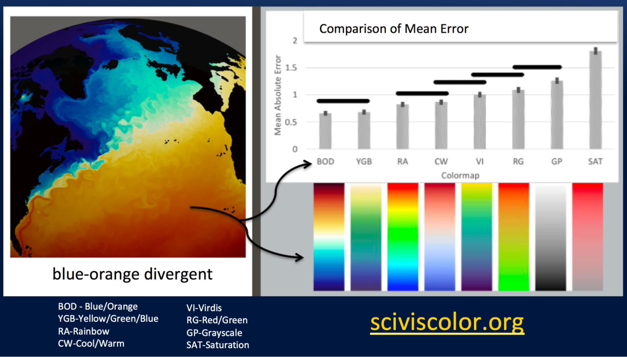
Color is a particularly tricky pre-attentive attribute. How well do people identify specific shades of colors? This is an interesting question regarding resolving power - how well can we resolve the different data associated with two very similar points. This paper compares mean error when users view data visualizations using a variety of color mapping schemes [Bujack2017]. As summarized in the figure below, the results of the study suggest that Blue-Orange Divergent provides the most resolving power.
In addition to guidelines for visualizations that are based on research into visualizations and perception, we should also look at graphic design guidelines and principles which are always relevant when designing anything with a visual component.

Rules of graphic design guide people’s attention in specific ways that help you tell a story.
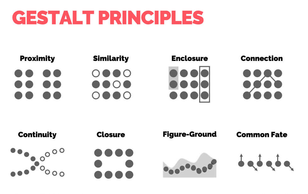
Gestalt principles direct how we group and associate items together (i.e. a data point and its label), so we should study them to create better visualizations.
Be careful when you choose fonts for your visualizations…

Some simple rules of thumb to help you choose fonts:
- Generally Sans-serif fonts (e.g. Helvetica, Arial) are good for on-screen text.
- Serif fonts (e.g. Times, Georgia) - are good for printed text (because print often has more resolution than computer screens).
- Monospace fonts (e.g. courier) are good for when you need exact alignment of text characters (e.g. source code or numbers in tables).
- Stylish fonts are best left for party invitations.
- Lower case words are read faster than words than upper case.
- Individual letters and nonsense words like UA1138 are read faster in upper case.
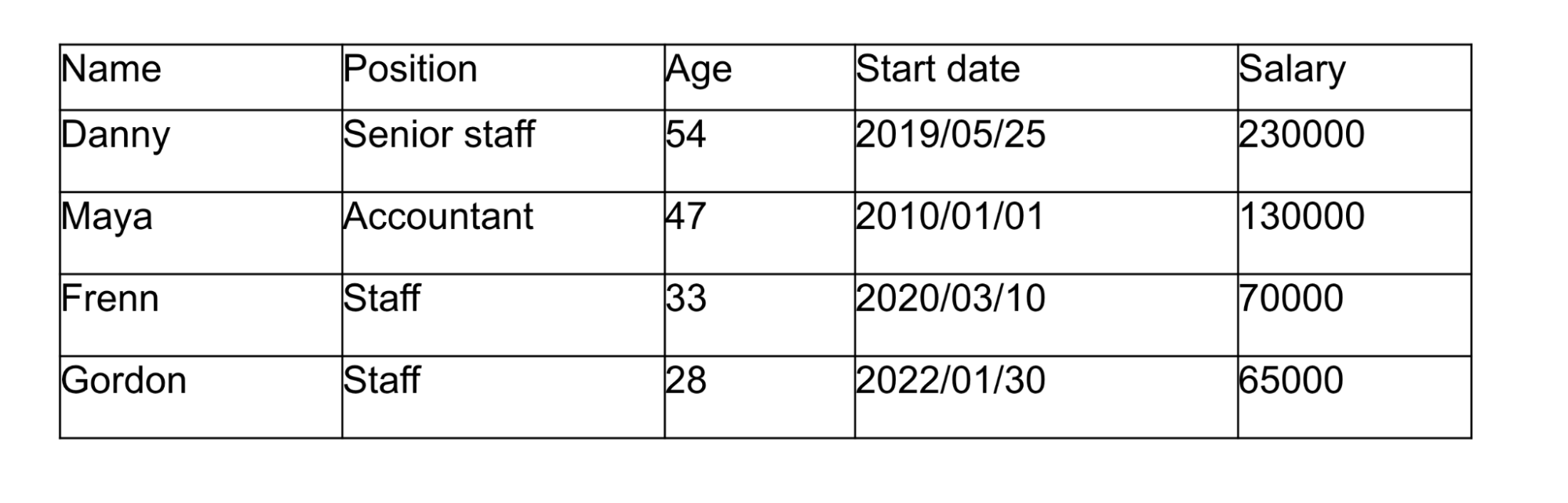
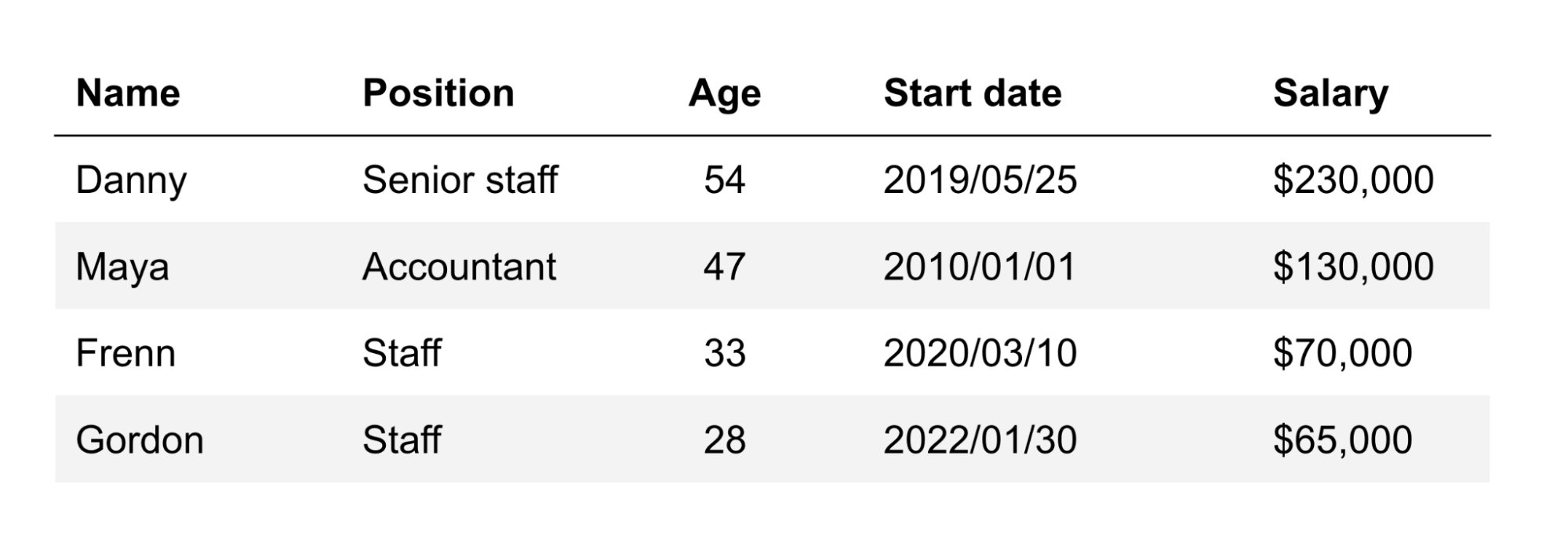
Following graphic design concepts improves readability. Consider the following data tables (a table is still a visual representation). What differences between these tables can you identify?
In summary, for most simple charts, follow these guidelines:
- Choose an appropriate visual encoding
- Make sure all axis are well labeled in terms of what the axis is and the units / categories
- Make sure there is a meaningful title
- Make sure there is a legend explaining what the various lines / points / colors mean
- Make sure all text labels are positioned near the items they describe
- Avoid 3D in simple charts
- Avoid fully saturated colors (they are usually unpleasant to look at)
- Choose the background color of the chart carefully (it should fit within its context and not clash with the colors you use for encoding, think about color blind people)
- Make sure items (lines, marks, etc.) can be differentiated from each other, look at the chart from afar, can you tell them apart?
- If you place values next to their data points make sure they are readable (in color and size)
Key Points
There are useful guidelines that one can use to select appropriate charts and visual encodings, and there are tools that will help you create those charts. However, the creation of novel forms of visualization is as much science as it is craft.
Design of visualizations is key to their effective communication of results.