4. Creating Visualizations with Code
Objectives
- Give you a comprehensive overview of Plot.ly and its benefits over other similar statistical visualization tools.
- Demonstrate the simplicity of creating Plot.ly charts.
Plot.ly is a library (application programming interface) for creating high quality charts. Plotly has an immensely rich collection of chart types, all of which are interactive. Another popular charting library is Matplotlib. Whereas Matplotlib only supports Python, Plotly supports Javascript, Python, as well as R. At its core, Plot.ly’s graphics are created in D3.js.

Dash is a Python library for making web-based interactive visualization dashboards of Plot.ly charts. Often to create web-based dashboards you need to code the frontend in Javascript. Dash allows you to do everything in Python.
The best place to go to begin learning is Plotly’s main library page, which will then direct you to tutorials for Plotly in Python, R, Javascript, as well as Dash.
Go to the main library page and take a look at either Plotly Python or Plotly Javascript then select one of the basic charts to look at the respective codes. Also take a look at Dash example galleries.
Note: for Plotly Python there are two ways to use Plotly. I recommend most users use Plotly Express (which is a very low-code library to Plotly’s most common charts). Most of the examples you will find use Plotly Express. For advanced needs you can learn to use Plotly Graph Objects.
As an example of how easy it is to create charts in Plotly Express, we will use enrollment data from across the UH System. Here are the lines of code you need to first make a barplot. Starting with importing relevant libraries:
import pandas as pd
import numpy as np
import plotly.express as px
import matplotlib.pyplot as plt
from itertools import cycle
And here we use Pandas for data wrangling:
enrollment_zipcode = 'https://tinyurl.com/enrollmentZipcode'
df = pd.read_csv(enrollment_zipcode)

#-- Define the semesters from Fall 2012 - Fall 2022
semesters = ['Fall 2012', 'Fall 2013', 'Fall 2014', 'Fall 2015', 'Fall 2016', 'Fall 2017', 'Fall 2018', 'Fall 2019', 'Fall 2020', 'Fall 2021', 'Fall 2022']

#-- Get unique institution names
institutions = df['IRO_INSTITUTION_DESCL'].unique()
#institutions = ['University of Hawai`i at Manoa', 'Kapi`olani Community College']

#-- For each institution, get the number of enrollment count for each semester
for institution in institutions:
  for semester in semesters:
    # Filter the dataframe that has the current institution and the semester
    filtered_df = df[(df['IRO_INSTITUTION_DESCL'] == institution) & (df['SEMESTER'] == semester)]
    # Get enrollment count for the filtered rows
    enrollment = filtered_df['ENROLLMENT'].sum()
    print(institution, '-', semester, ':',  enrollment)

# Declare arrays of hawaiian students and non-hawaiian students by institution
hawaiian_students = []
non_hawaiian_students = []

#-- For each institution, get the number of enrollment count of Hawaiian and Non-Hawaiian Students for all semesters combined
for institution in institutions:
  # Filter the dataframe rows that has the current instutution and HAWAIIAN_LEGACY column filled in as HAWAIIAN
  filtered_hi = df[(df['IRO_INSTITUTION_DESCL'] == institution) & (df['HAWAIIAN_LEGACY'] == 'HAWAIIAN')]
  # Get the number of enrollments for Hawaiian students for all semesters combined
  enrollment_hi = filtered_hi['ENROLLMENT'].sum()
  hawaiian_students.append(enrollment_hi)

  # Filter the dataframe rows that has the current instutution and HAWAIIAN_LEGACY column filled in as NOT HAWAIIAN (Blank)
  filtered_nonhi = df[(df['IRO_INSTITUTION_DESCL'] == institution) & (df['HAWAIIAN_LEGACY'] != "HAWAIIAN")]
  # Get the number of enrollments for non-Hawaiian students for all semesters combined
  enrollment_nonhi = filtered_nonhi['ENROLLMENT'].sum()
  non_hawaiian_students.append(enrollment_nonhi)
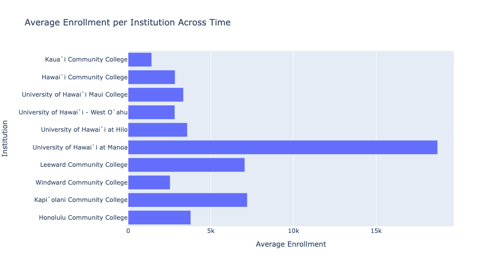
Next, we use plotly express to create a bar plot:
# Get unique institution names
institutions = df['IRO_INSTITUTION_DESCL'].unique()

# Calculate average enrollment for each institution across all semesters
average_enrollment_per_institution = []

for institution in institutions:
    enrollment_per_semester = []
    for semester in semesters:
        # Filter the dataframe that has the current institution and the semester
        filtered_df = df[(df['IRO_INSTITUTION_DESCL'] == institution) & (df['SEMESTER'] == semester)]
        # Get enrollment count for the filtered rows and add it to the enrollment_per_semester list
        enrollment = filtered_df['ENROLLMENT'].sum()
        enrollment_per_semester.append(enrollment)

    # Calculate the average enrollment for the institution
    average_enrollment = sum(enrollment_per_semester) / len(enrollment_per_semester)
    average_enrollment_per_institution.append(average_enrollment)

# Create DataFrame with institution and average enrollment
data = pd.DataFrame({'Institution': institutions, 'Average Enrollment': average_enrollment_per_institution})

# Create bar chart using Plotly Express
fig = px.bar(data, x='Average Enrollment', y='Institution', orientation='h', title='Average Enrollment per Institution Across Time')

# Show plot
fig.show()
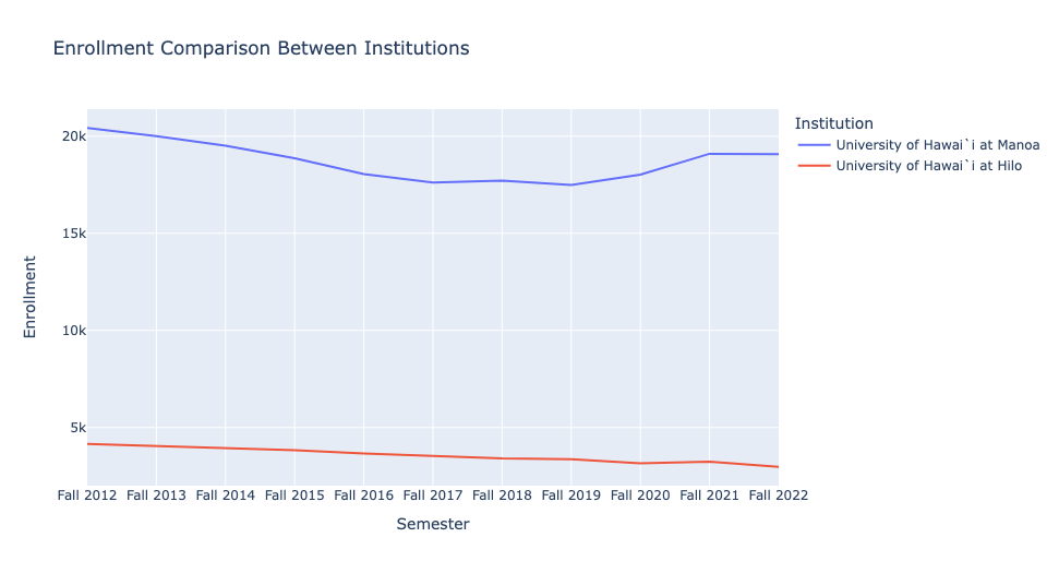
We can then look at the enrollment across two institutions through time:
# Define the institutions
institutions = ['University of Hawai`i at Manoa', 'University of Hawai`i at Hilo']

# Initialize lists to store enrollment data for each institution
enrollment_data = []

# Loop through each institution
for institution in institutions:
    # Filter the DataFrame for the institution
    df_inst = df[df['IRO_INSTITUTION_DESCL'] == institution]

    # Get the enrollment data for the institution across the semesters
    enrollment_inst = [df_inst[df_inst['SEMESTER'] == semester]['ENROLLMENT'].sum() for semester in semesters]

    # Append enrollment data to the list
    enrollment_data.append(enrollment_inst)

# Create DataFrame
data = {'Semester': semesters, institutions[0]: enrollment_data[0], institutions[1]: enrollment_data[1]}
df_plot = pd.DataFrame(data)

# Melt DataFrame to long format
df_plot = df_plot.melt(id_vars='Semester', var_name='Institution', value_name='Enrollment')

# Plot line graph using Plotly Express
fig = px.line(df_plot, x='Semester', y='Enrollment', color='Institution', title='Enrollment Comparison Between Institutions')

# Show plot
fig.show()
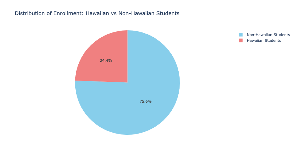
We can also investigate enrollment by Hawaiian legacy with a pie chart:
# Get data
labels = ['Hawaiian Students', 'Non-Hawaiian Students']
sizes = [sum(hawaiian_students), sum(non_hawaiian_students)]

# Create DataFrame
data = {'labels': labels, 'sizes': sizes}

# Plot pie chart using Plotly Express
fig = px.pie(data, values='sizes', names='labels', color_discrete_sequence=['skyblue', 'lightcoral'],
             title='Distribution of Enrollment: Hawaiian vs Non-Hawaiian Students',
             hole=0.0,  # Hole in the center
             )

# Show plot
fig.show()
Lastly, should you venture into creating Dash dashboards, and wish to make them publicly viewable, you will need to host a Python server. An easy way to do this is to use Pythonanywhere.
Key Points
- Plot.ly is a popular statistical visualization library that works in multiple programming languages including Python, Javascript, and R
- Easier to code with Plot.ly
Chart Studiocan be used to produce Plot.ly charts and dashboards without codingDashallows for creation of visualizations and dashboards using only Python.
Bio Break!
Let’s take a brief break to stretch before moving on to the next page. See you in a few minutes.