4. Tableau Tutorial
Overview
Objectives
- Provide you with an introduction to the Tableau User interface.
- Help you get started with simple graph plotting with Tableau.
Tableau: Revolutionizing Data Analysis and Visualization
In 2003, a brilliant team of computer science enthusiasts at Stanford embarked on a mission to democratize data analysis. Their vision was to create a tool that would make it easy for everyone to gain insights from complex data sets. The result of their tireless efforts is Tableau, a data visualization software that has revolutionized the way people work with data. At the heart of Tableau’s success is its groundbreaking technology, VizQL. VizQL’s intuitive interface translates even the most complex data queries into simple drag-and-drop actions, empowering users to visualize and analyze data seamlessly. With Tableau, you can turn mountains of data into interactive, visual insights in a matter of minutes. With its easy-to-use interface and powerful capabilities, Tableau continues to transform the way people work with data, making it more accessible and impactful than ever before.
Initial Screen Overview
When you log into Tableau, you are presented with a dashboard-like interface.
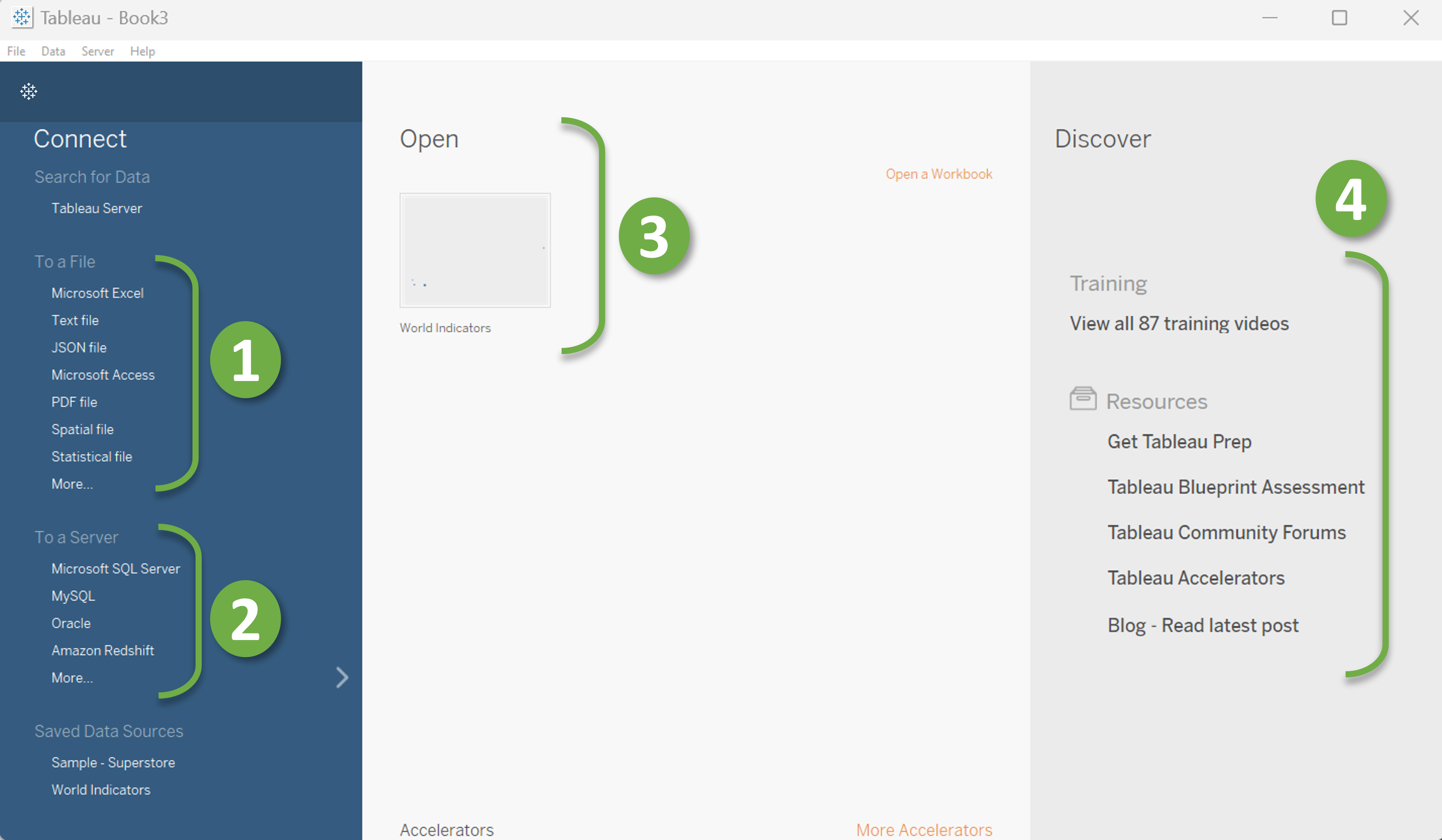
The Tableau initial interface is divided into three sections: the left pane, the middle pane, and the right pane.
The right pane contains resources to help you learn Tableau. This pane is marked with the number “4” in the image. Here, you’ll find a wealth of information on how to use Tableau, including tutorials, forums, and other helpful resources.
The middle pane contains your previous workbooks. These workbooks are marked with the number “3” as you can see in the image. This pane is a great way to keep track of your previous work and quickly access it when you need to make updates or changes.
The left pane contains all the connectors you need to load data into Tableau. As you can see in the image, the connectors are divided into two sections: file connectors (marked with “1”) and server connectors (Marked with “2”). The file connectors allow you to load data from files like .csv, .tsv, or .hyper, while the server connectors allow you to connect to MySQL servers or other options. If your desired file type is not in the file connectors list, don’t worry. Simply click “More” to open a file browser, where you can select your desired files (marked with “*” in the following image).

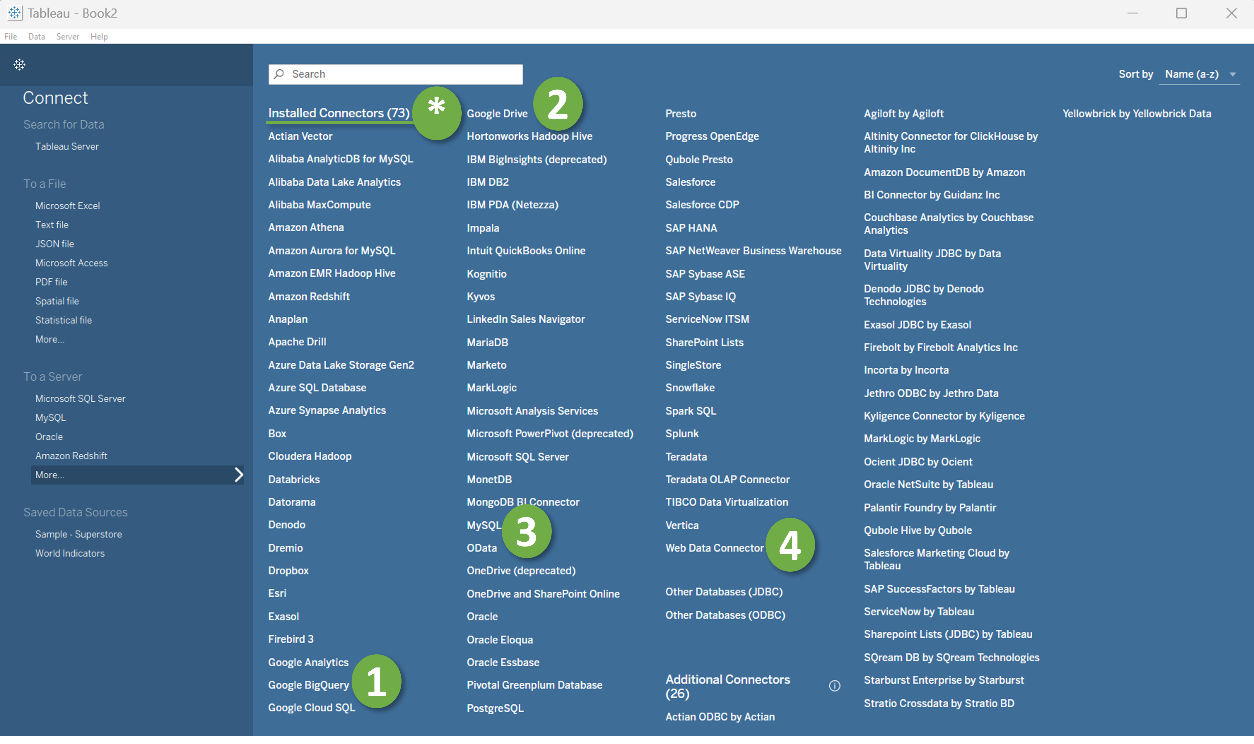
Similarly, If your desired server connector is not in the server connectors list, you can click “More” to open a list of server connectors. At Tableau 2022.4.0 There are 73 available server connectors (Marked with “*” in the following image). It has popular data reservoirs like Google Bigquery (Marked with “1”), Google Drive (Marked with “2”), MySQL (Marked with “3”), or any Web data connectors (Marked with “4”). Even with this versatile range of options, if your desired connector can’t be found in the list, you may create a custom connector for your datasource.
Load Data-source
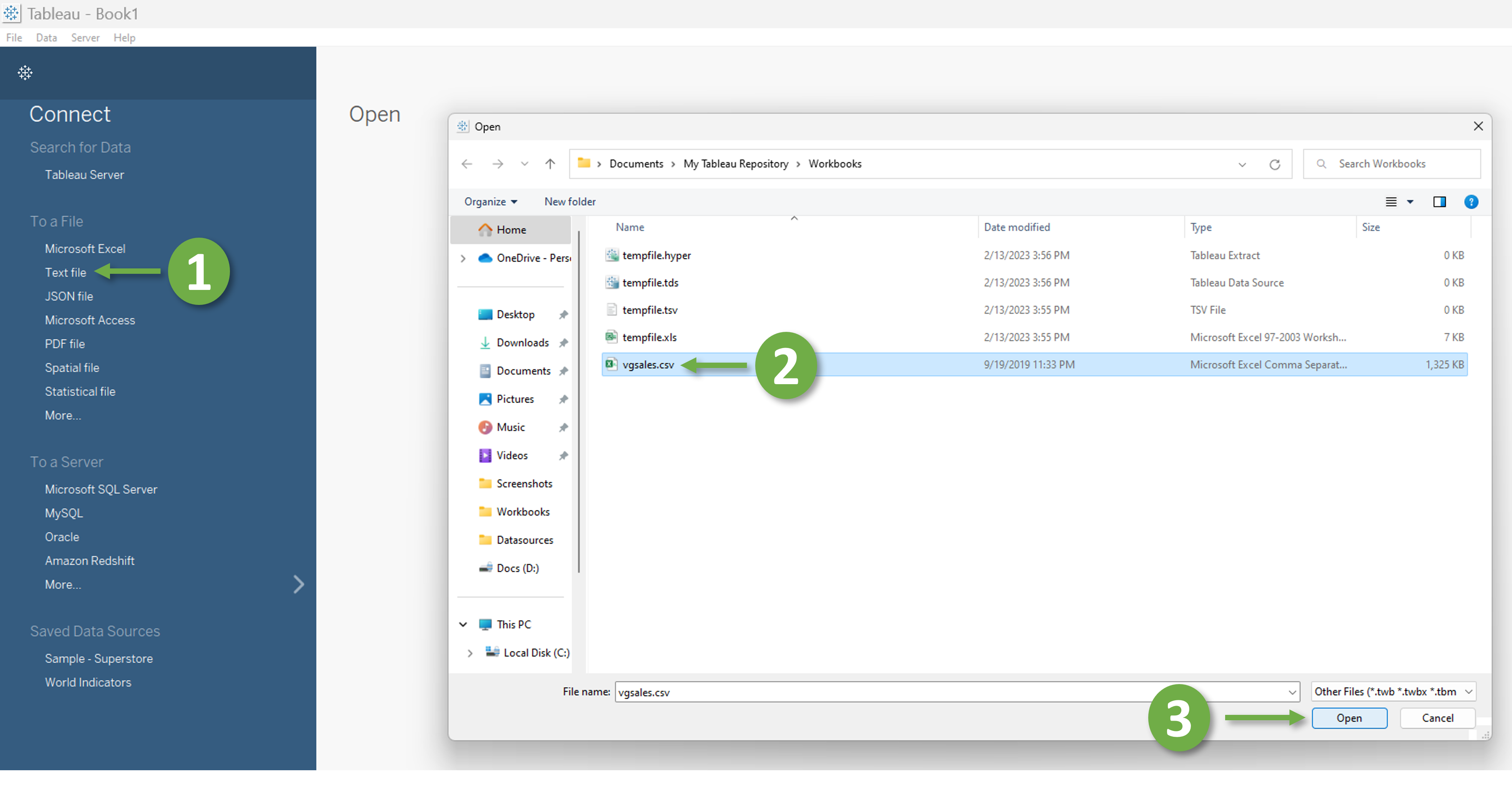
For this tutorial we shall use one of the most popular filetypes for storing data - “.csv” - a short form for “Comma Separated Values”. Be aware, even though, most of the time, we load .csv files with Excel, it’s actually a text file where data is separated by a specific separator; most commonly the searator is comma or tab. To load the data, we need to click “Text File” on the left panel (Marked with 1 in the folloing image) and select the CSV file we want to work with.
Data Dashboard Interface Overview
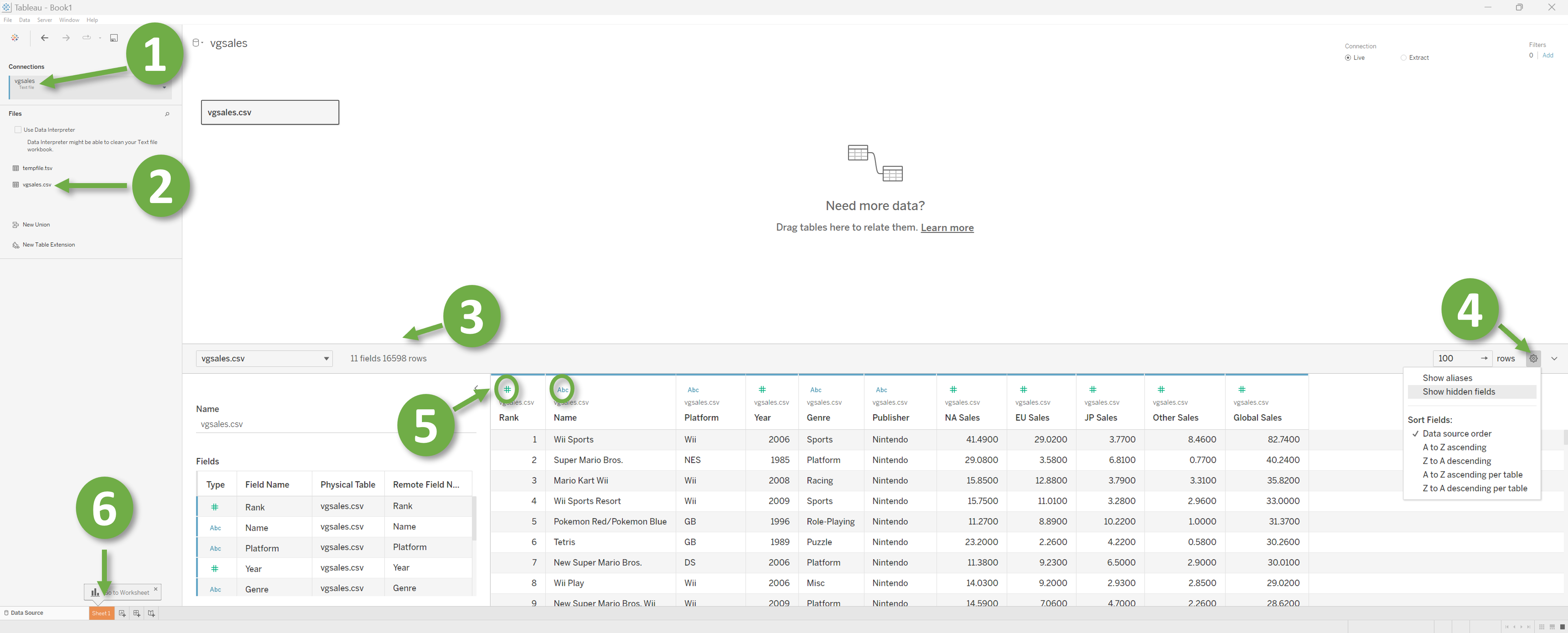
Once we have successfully loaded the data, we will be directed to a comprehensive Dashboard that encapsulates a multitude of features designed to enhance the readability of the data. The section denoted by “1” in the accompanying image contains the file connectors, with a text file connection being appropriate for our purposes. The section marked as “2” displays the previously loaded files. Additionally, the “3” area provides information on the number of columns and rows, with our current example consisting of 11 columns (referred to as fields throughout the tutorial) and 16,598 rows. The Gear icon highlighted as “4” provides options for sorting data, while the “5” area displays the field names and field types, which can be String values, Date values, Date & Time values, Numeric values, Boolean values, Geographical values, Cluster or mixed values. Finally, the main workspace located at the bottom of the Dashboard is known as “Worksheets” (Marked with “6”). Although the panel also offers options to open “Dashboards” and “Stories”, they will not be covered in this tutorial.
Worksheet interface Overview
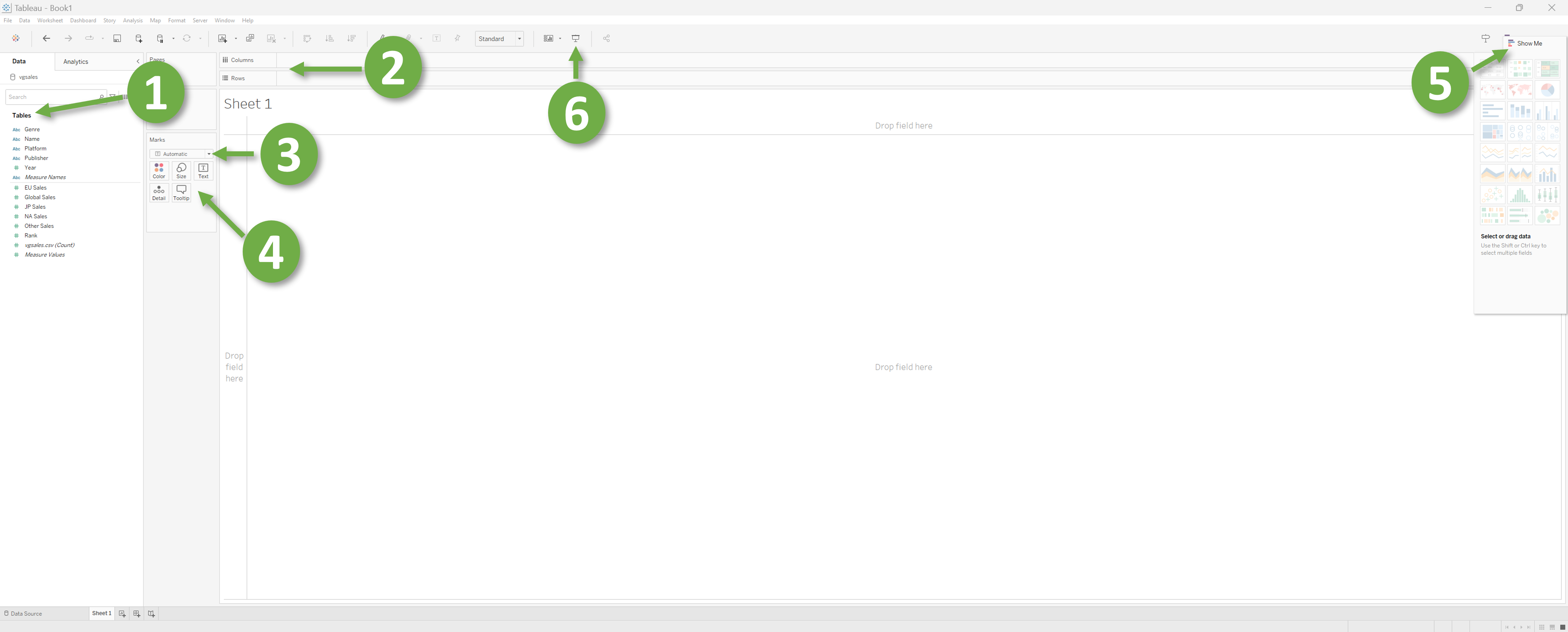
The Tables section, highlighted as “1” in the accompanying image, displays all available fields within the dataset. The names of these fields are accompanied by an indication of their respective data types to the left. Divided into two sections, the names atop the line (in our case, the top six) are called “Dimensions”, while those beneath are referred to as “Measures”. In the area marked as “2”, we can observe the rows and columns of the graph, which can be manipulated by dragging and dropping fields into this section. The dropdown menu denoted by “3” offers options for selecting the graph type. Setting it to “Automatic” will automatically alter the graph type to align with the fields dropped in the Rows and Columns section (marked as “2”). The pane marked with “4” offers an array of configurable attributes for the graph. The button marked by “5” displays graph types that align well with the data while disabling others. Finally, the button marked as “6” leads to a presentation view that allows a full-screen display of the graph.
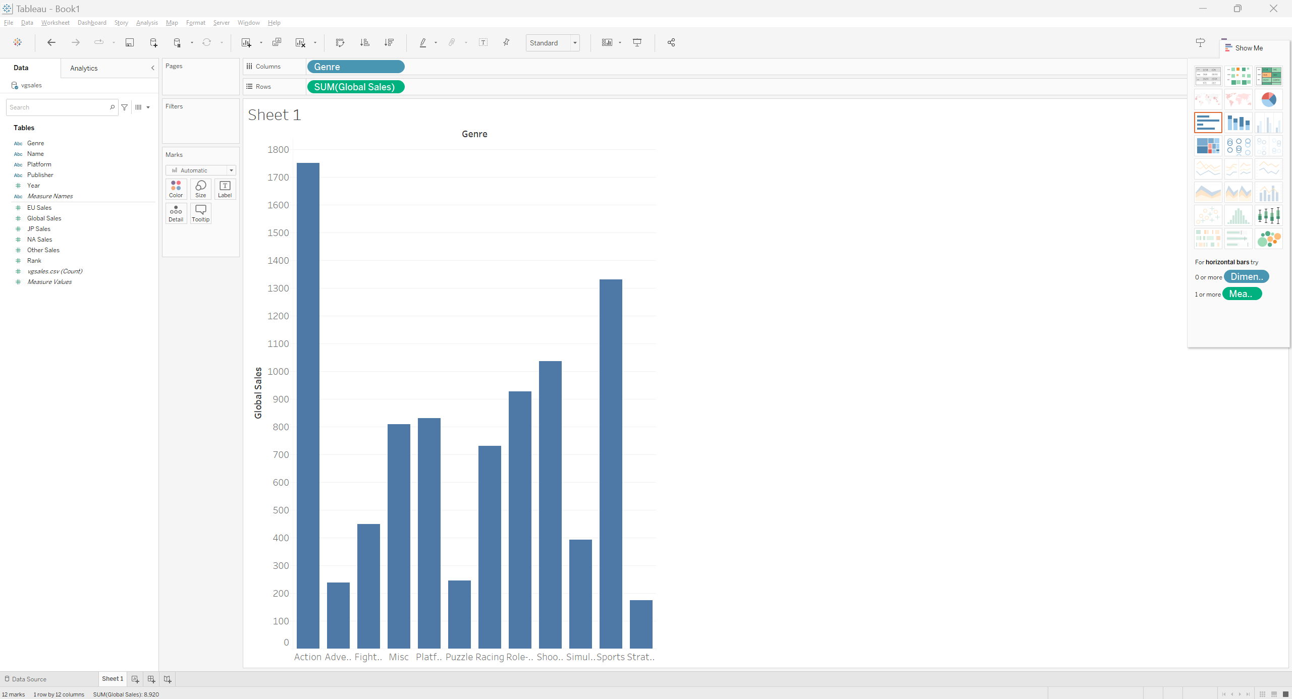
Our first Plot
Now we have enough familiarity with the interface. Let’s make our first plot. From the “Tables” pane drag and drop “Global Sales” to Rows and “Genre” to Columns. Voila!! We have our first plot without any code at all!!! Your plot should look like the following.
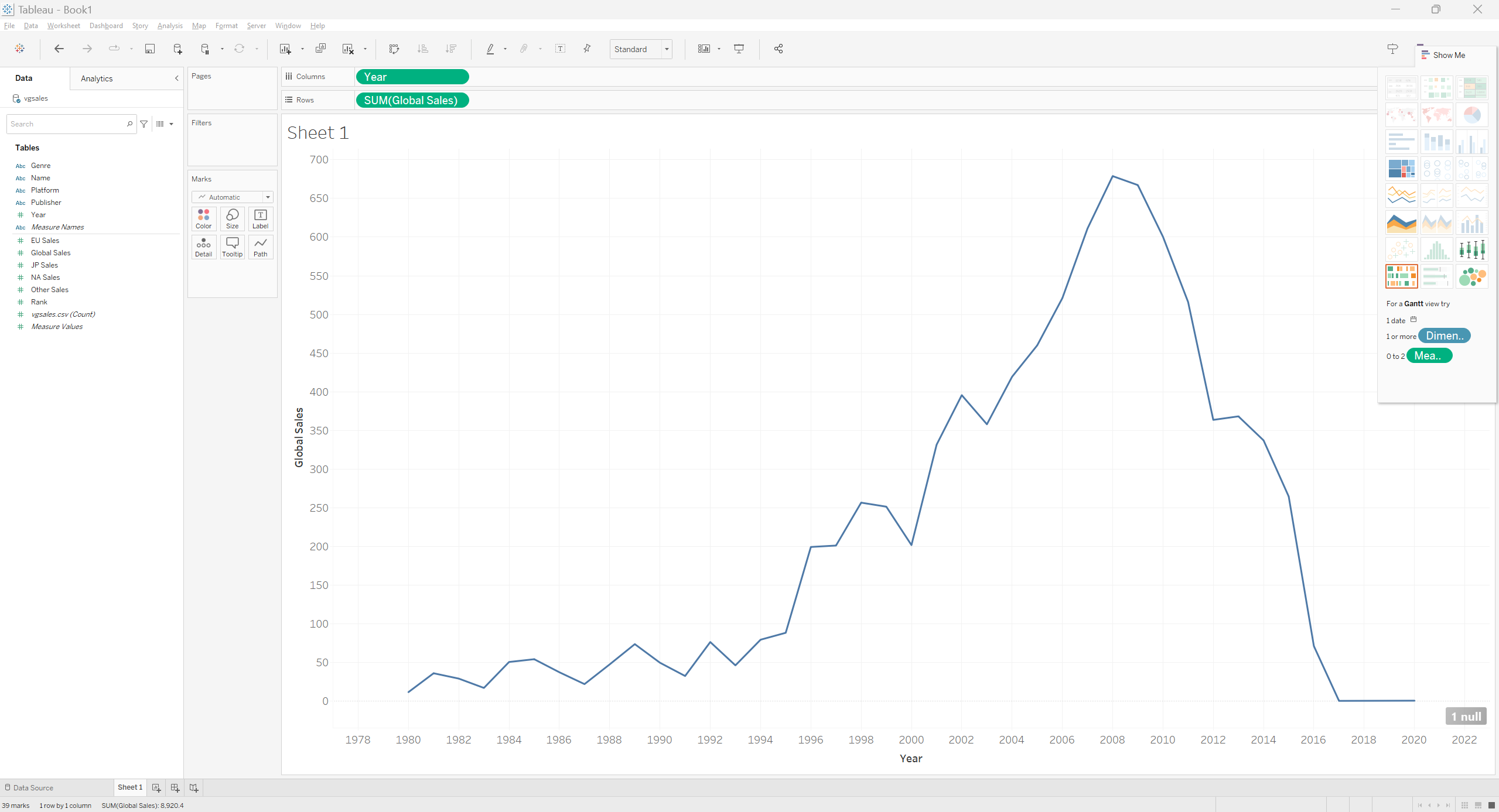
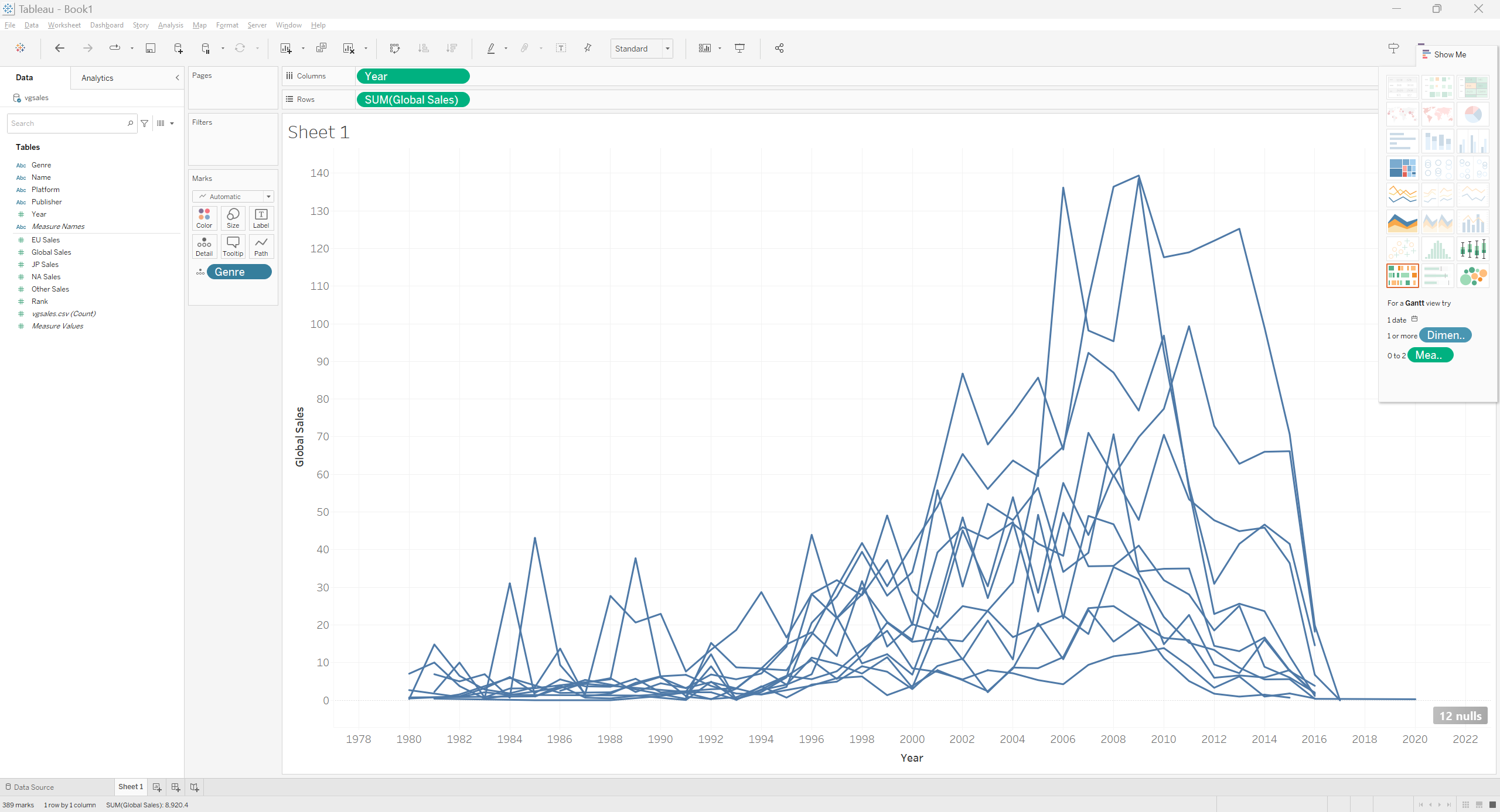
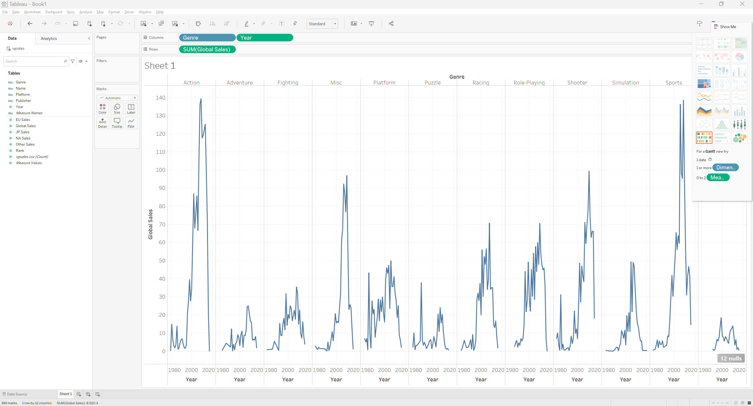
Similarly, We can generate a different graph by placing “Year” at columns instead of “Genre”.
Let’s heat things up a bit
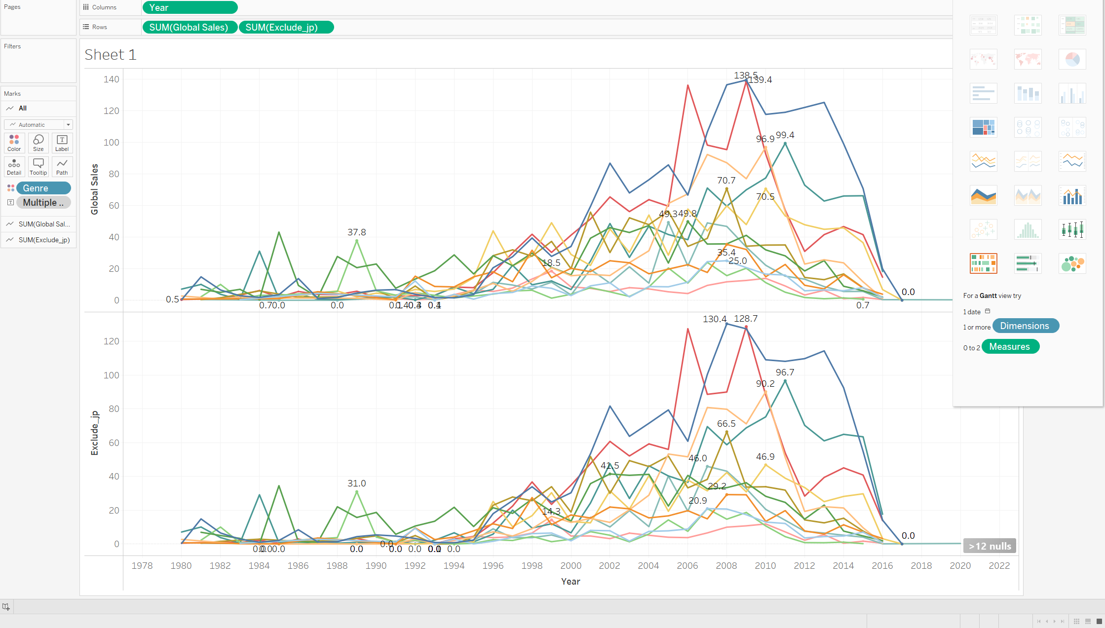
The Year vs Global Sales graph is a bit dull and dosen’t contain much information, right? Let’s break the sales into different Genres. To do that we will need to drag and drop Genre into the Marks section. The graph should now contain sales for all the genres by the years.
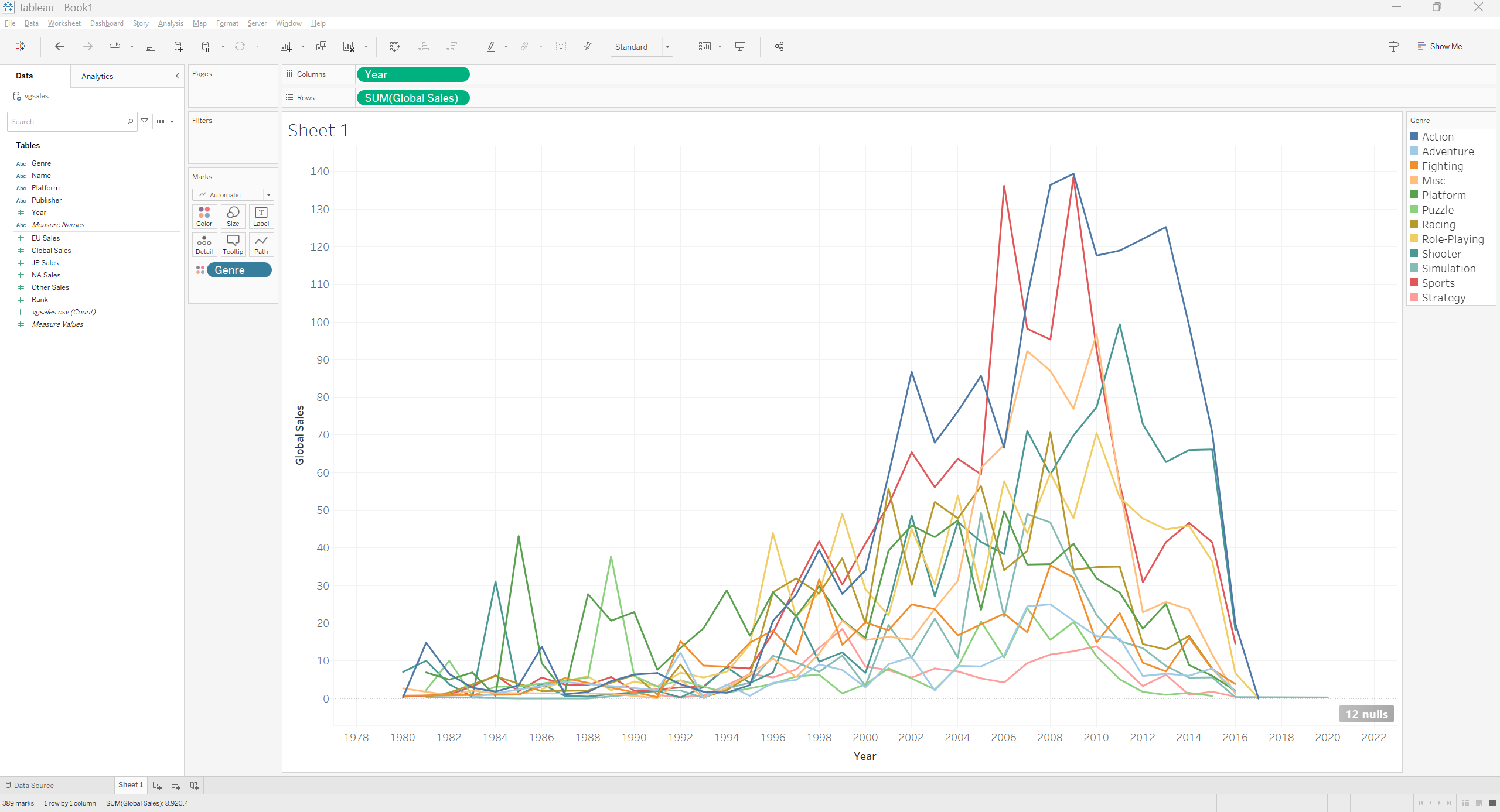
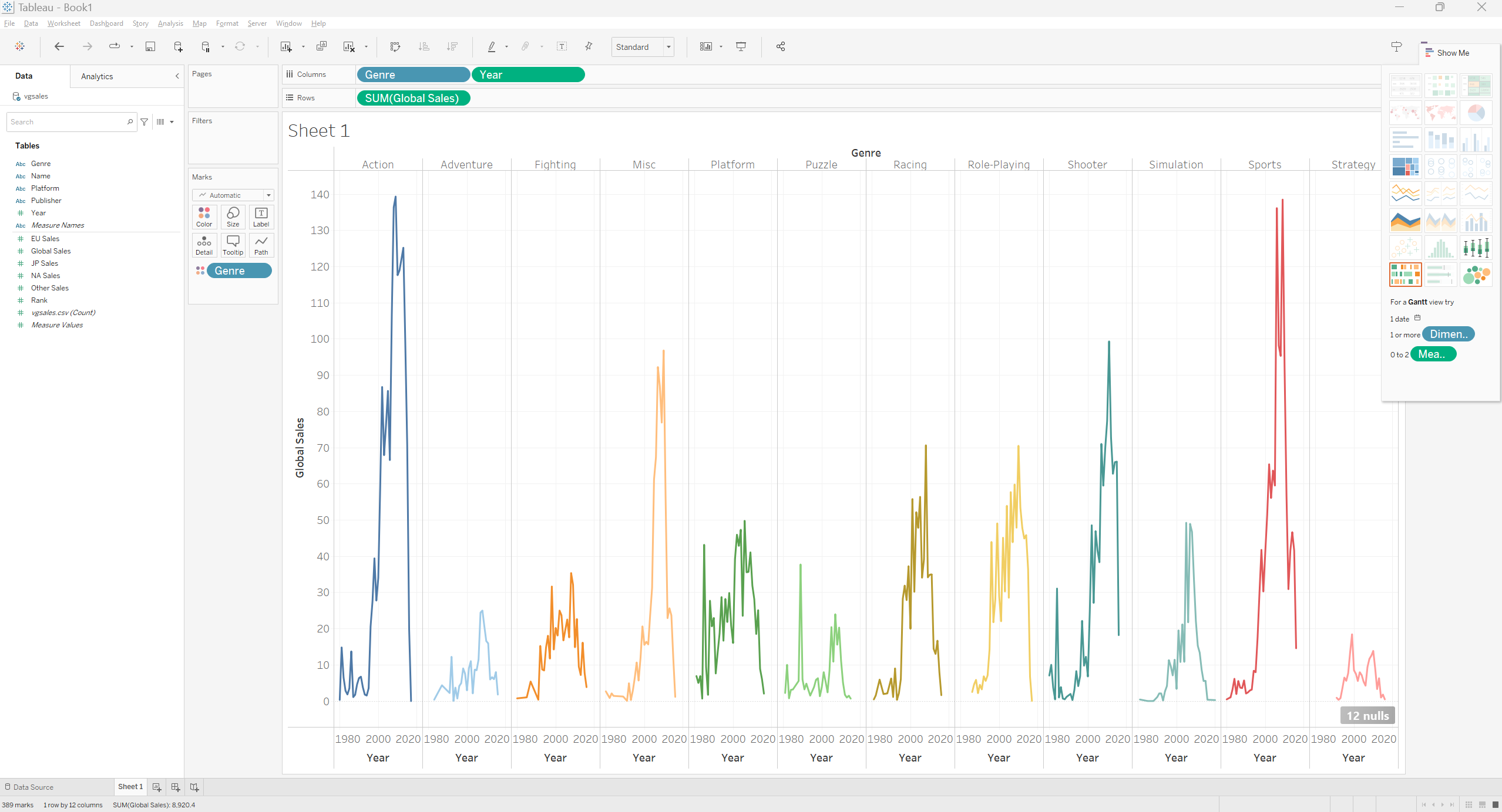
But it’s hard to see which line belongs to which genre. To have a better understanding let’s assign a different color to each genre. We can do that in 2 ways. Either click on the icon left to “Genre” and select color or drag and drop Genre into the Color mark. That should give us a beautiful graph.
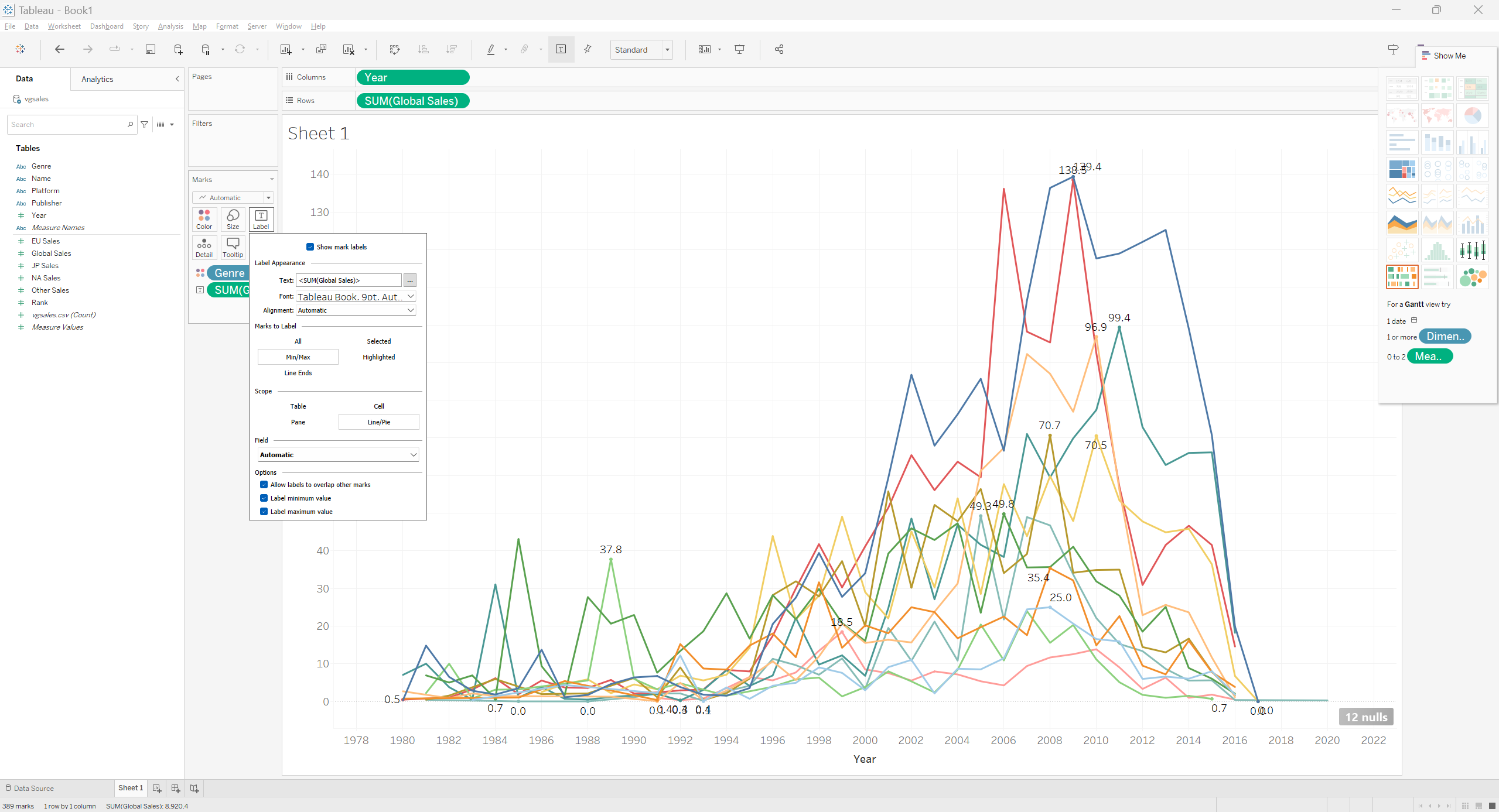
The graph looks good now, but it still lacks information. We can label the graph with values by dragging and dropping the Global Sales field onto the Label Mark. We can edit how which values we want to see on the graph by left clicking on the Label Button.
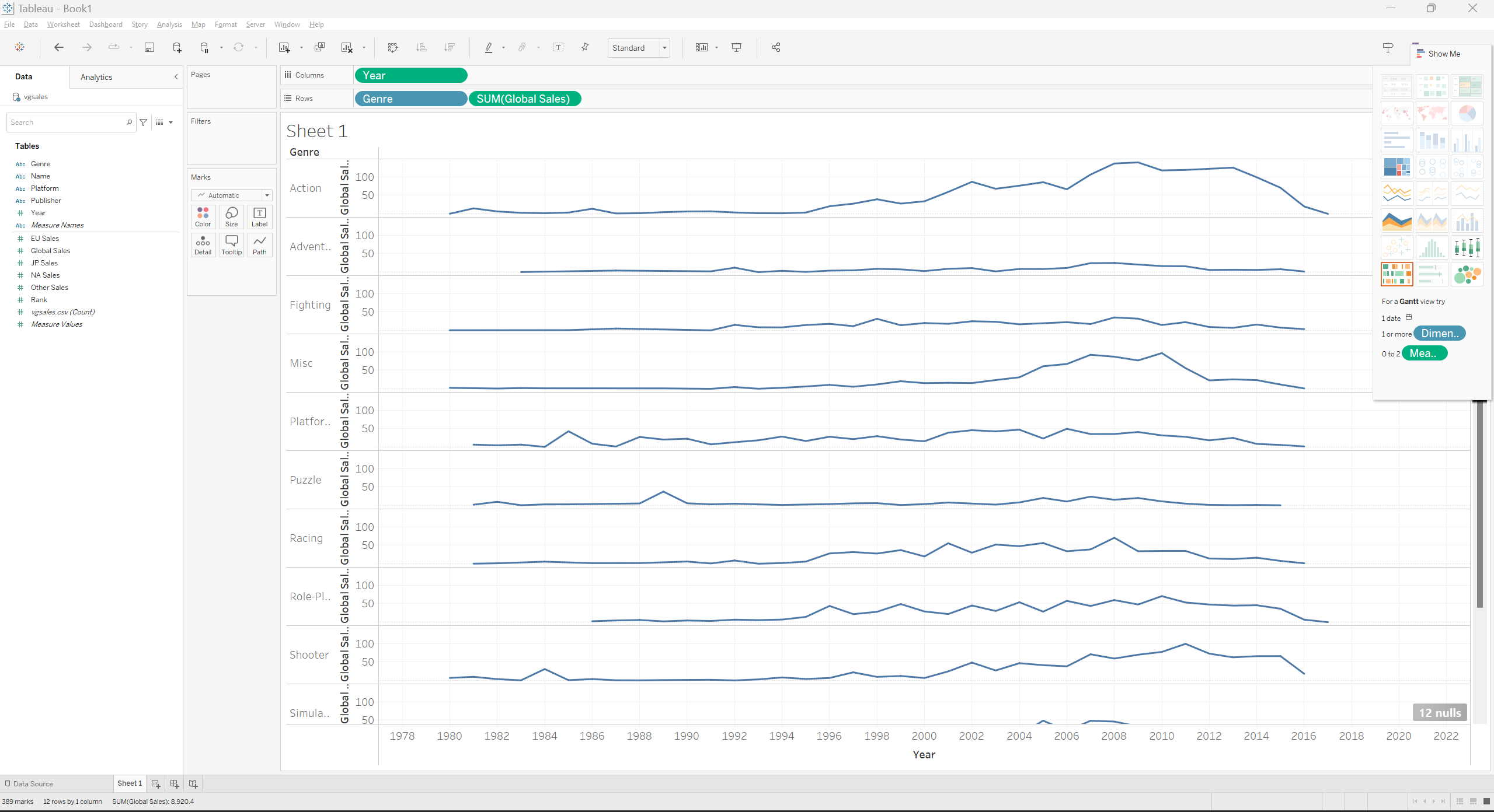
We can play around with the different fields and place them as rows or columns to generate different graphs.
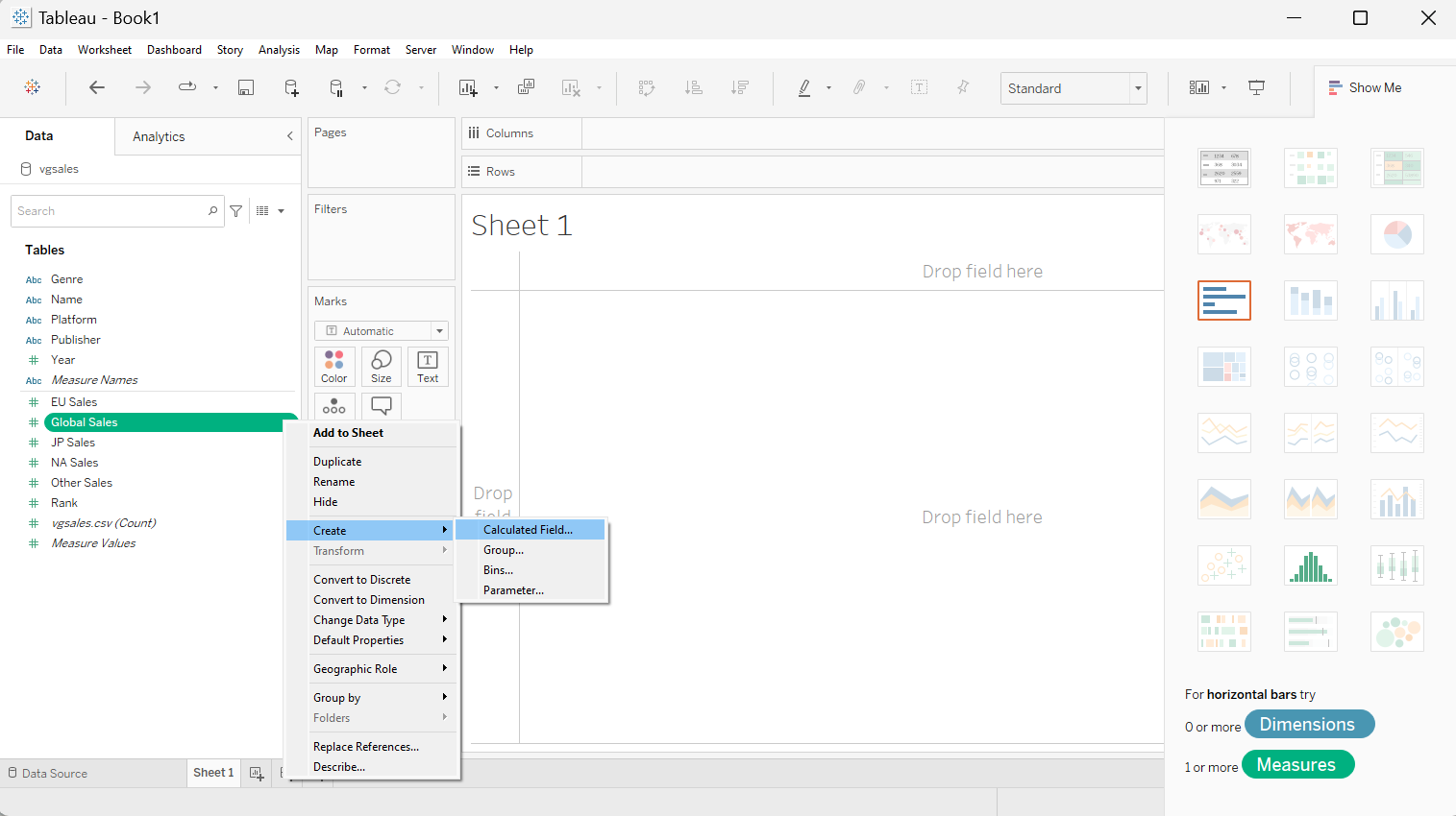
Calculated Fields
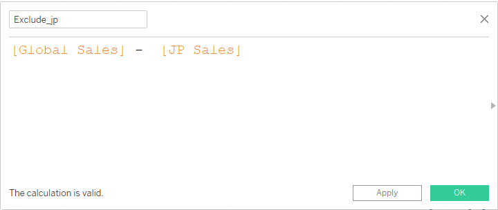
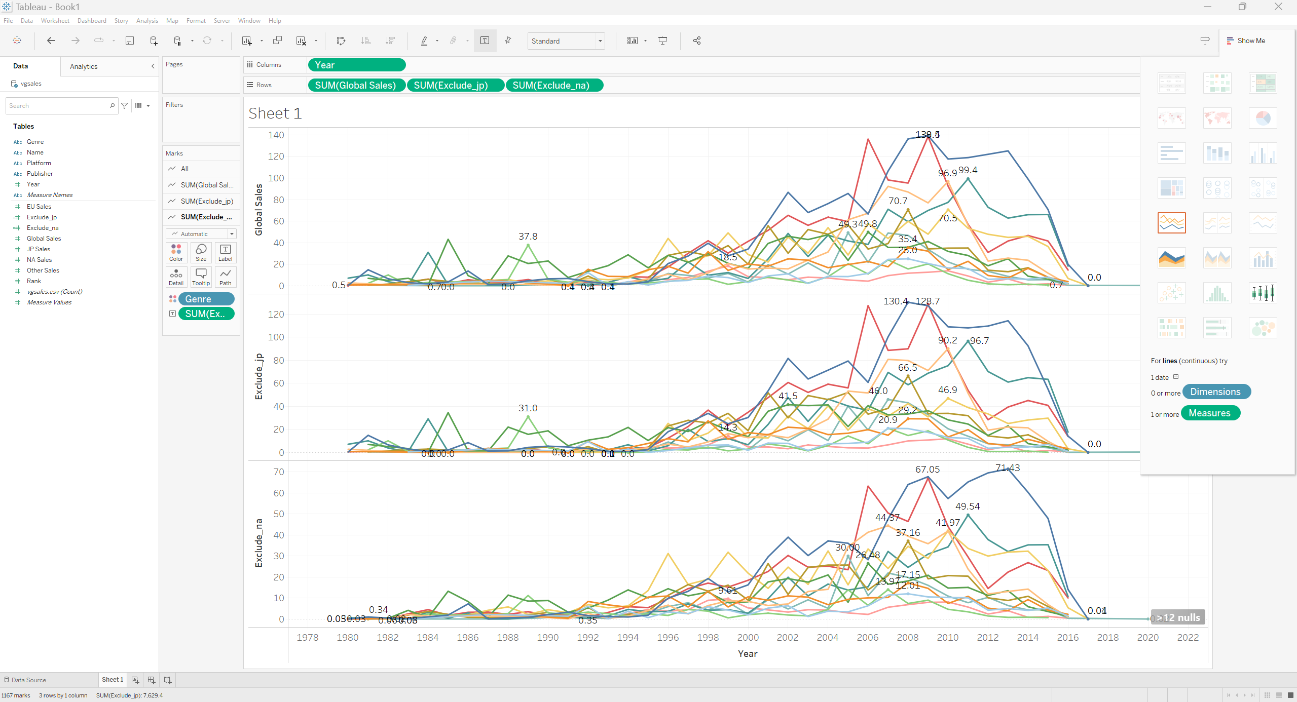
We can create new fields as an arithmatical result of the other fields. For an example we can exclude The Japanese Sales from the Global Sales to see its impact on the global sales.
Similarly The N.A. sales can be removed from global sales to see a comparative impact. Try it yourself to create a similar graph as follows.
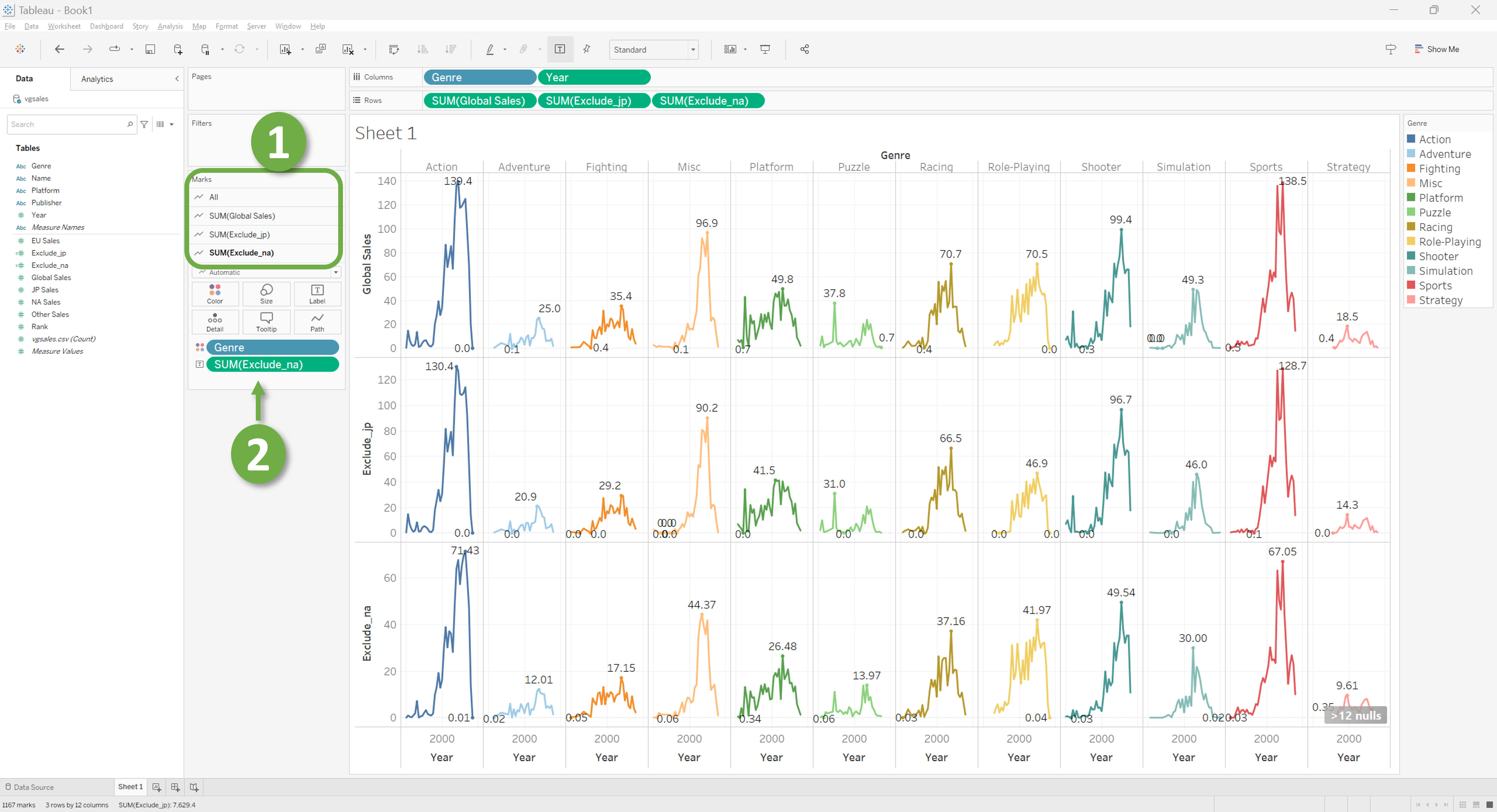
Now try dropping Genre in the Columns to have a representation split across gonre. Notice that the “Markes” Section (Highlighted by “1”) has the fields you put in Rows. Make sure to set the attributes differently for each graph to have meaningful labels across the graphs. You can check which Label you are displaying at the Mark highlighted with “2”.
Where do we go from here?

As this workshop aims to give an introduction to tableau, we started with straightforward graphs and ended up with a much complex graph. But Tableau is much more powerful than that. It allows us to join multiple tables, make connections between tables, select data based on condition and much more. It let’s us build fabulous dashboards with unique visuals which looks good on portfolios, websites, or research papers.
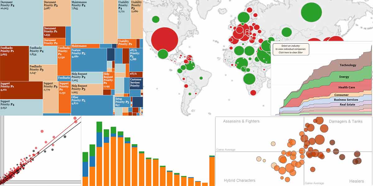
Tableau has so many options that sometimes it may feel like its use is bound by our imaginations. Here is a Youtube playlist that will guide your spark of interest to a burning flame of passion fueling your motivation to go further with data visualization.
If you want to make a project with Tableau, below is a wonderful Tableau project made from scratch.
Key Points
- Tableau has an easy-to-learn inteface.
- It’s easy to get started with Tableau.
- Simple graphs are very easy but complex graphs can be really hard to plot.