1. Introduction to Data Visualization
Learning Outcomes
This workshop will enable you to:
- understand the role of data visualization in the research enterprise;
- increase your awareness of what makes good and bad visualizations;
- know basic steps for creating effective visualizations;
- know about contemporary tools for creating visualizations.
Overview
Data Visualization is a vast field so it would be impossible to cover everything in a 2-hour workshop. Like literacy, good data visualization takes years to master.
So this workshop is intended to introduce you to data visualization by:
- Giving you an example of a good visualization;
- Increasing you awareness of common visualization mistakes;
- Providing you with tips on how to approach creating more effective visualizations;
- Providing you with a source for good visualizations for you to aspire to;
- Introducing you to contemporary tools.
Data visualization is the representation of data through use of graphics, such as charts, infographics, and animations. The goal is to communicate complex data relationships and data-driven insights in a way that is easy to understand.
Visualization can be applied throughout your entire research workflow to help you:
- find problems with the data early in the gathering process, so you can correct the problem before wasting time collecting potentially erroneous data.
- comprehend large amounts of data.
- see both large-scale and small-scale features to understand the “forest for the trees.”
- discover unanticipated emergent features.
- answer questions about the data.
- ask new questions or form new hypotheses about the data.
- tell stories about the data to others, such as to lay audiences.
An Example of a Good Visualization
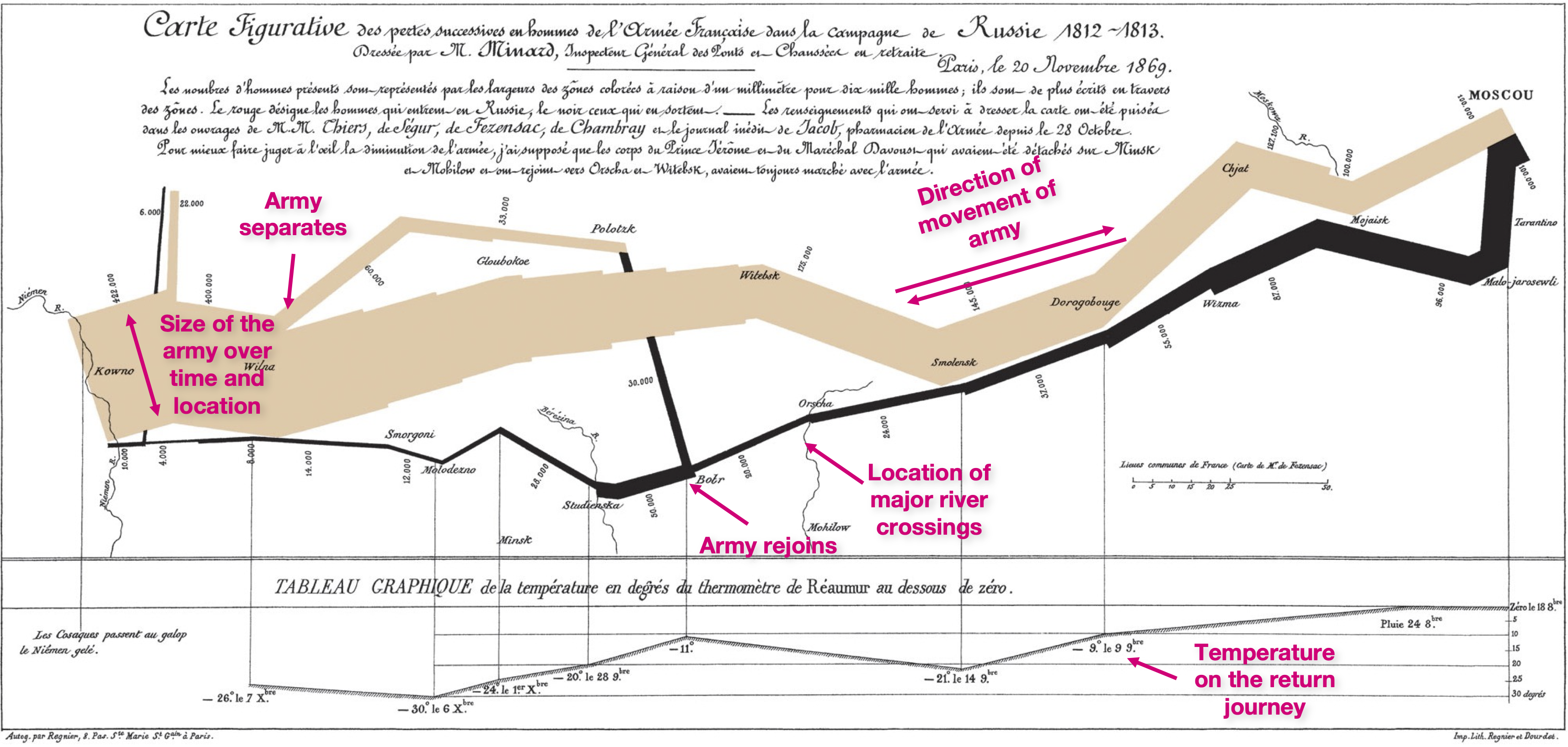
The figure below shows a visualization made by Charles Joseph Minard in 1861 depicting Napoleon’s losses during his 1812 march to and from Moscow, from Lithuania. This is a compelling visualization because it is able to depict 5 pieces of information in one image:
- the size of the thick tan line shows the size of Napolean’s army, its location, and time during their march to Moscow (on the right).
- the thick black line shows the same for the return journey.
- the location of major river crossings.
- the temperature on the return journey.
- the direction of the movement of the army and when armies separate and rejoin.
Some Examples of Bad Visualizations
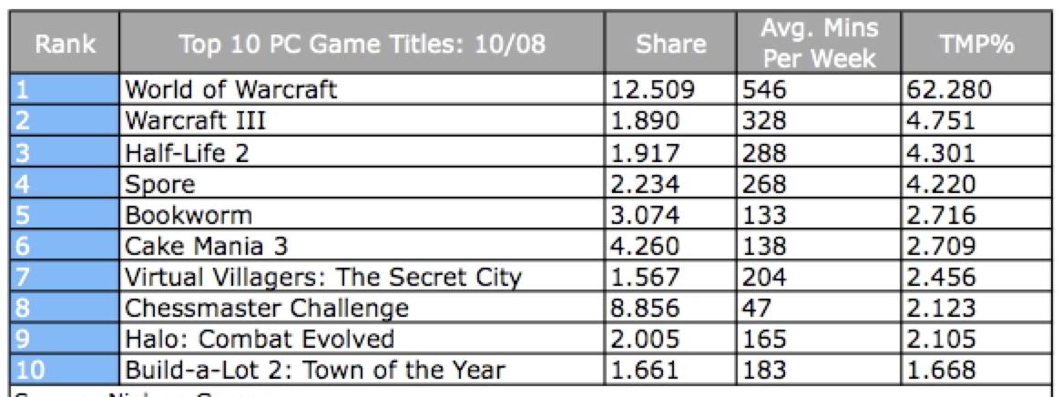
Now let’s take a look at a few common visualization mistakes, starting with Tables. To most people the following table looks fine. To a visualization expert there are many things that can be done to make it easier to interpret.
Here is a better version of the table:
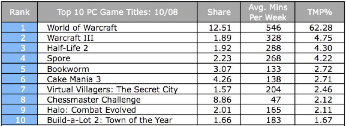
Several rules have been applied to improve the presentation of the table. They are:
- The results should not show greater accuracy than the original measurements. Don’t let Excel etc add on extra digits.
- The numbers should only show enough precision for the audience to see the trend – more digits can obscure that trend.
- Space padding for improved readability.
- Right justify numbers to make magnitudes easier to compare.
- Left justify text.
- Align decimal points.
For graphs (e.g. line graphs):
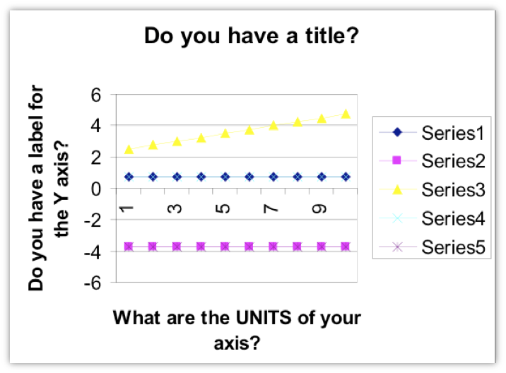
- Just because a charting program produces a chart does not necessarily mean it is a good chart. Below is a chart made by an old version of Microsoft Excel.
- Make sure the graph lines and glyphs are easily visible for the target medium (e.g. print, or presentation on a projector). Even though a chart may look fine on a computer screen, it may not be clearly visible when projected on a screen, or seen at the back of a large auditorium.
- Avoid simply using the typical fully saturated color values: e.g. red (255,0,0), green (0,255,0), blue (0,0,255), cyan (0,255,255), magenta (255,0,255), yellow (255,255,0). These colors are typically used on older computers with limited color palettes. Modern computers are equipped with over 16 million colors to choose from.
- Make sure the chart has units, a legend, labels for the axes and a title.
- Make sure numbers don’t have extraneous significant digits.
Avoid using 3D in charts
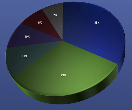
Try to avoid using 3D in charts. They look pretty but they make it harder to compare data. Here are some examples:
In this 3D piechart the 29% looks bigger than the 35%.
The following chart distorts the depiction of data not only because it uses 3D but because the population axis does not start at zero.
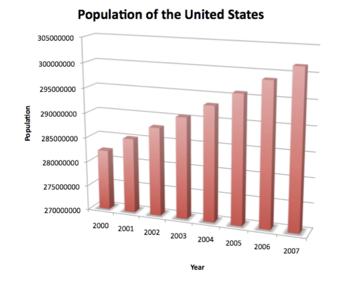
The chart gives the impression that the population in the US has been increasing dramatically from 2000 to 2007.
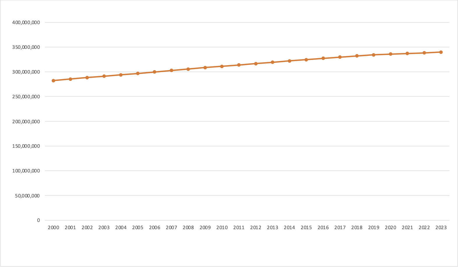
Compare this against the less dramatic representation below where zero is included in the vertical axis. Also note, in this representation commas have been included to make the interpretation of the population numbers easier.
Often when presenters present a chart they expect the viewer to be able to instantly interpret it. This is never the case.
To ensure they truly understand your chart you need to:
- give them time to read and interpret the axes of the chart, as well as time to see the trend in the chart.
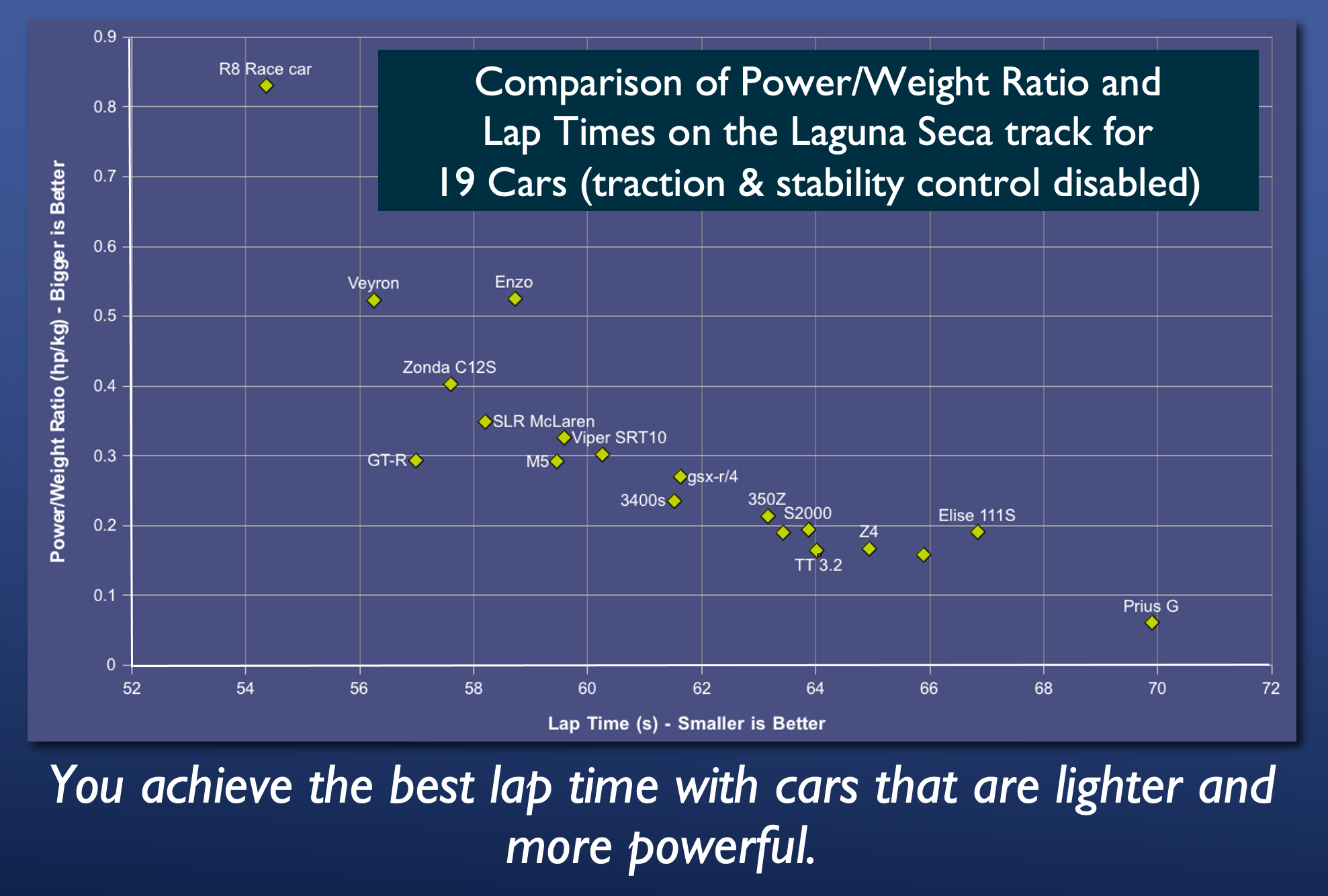
- include a short sentence describing the graph’s conclusion, in addition to the title.
For example. If I were to present the following chart to an audience I might say: “This is a chart comparing power/weight ratio and lap times for 19 cars driven around the Laguna Seca race track. The vertical axis shows the power to weight ratio of the car- bigger values are better. The horizontal axis shows the time per lap- smaller values are better. This chart shows that you achieve the best lap times with cars that are lighter and more powerful.”
Be careful when using pie charts
Pie chart are popular in financial reports. But in truth they are one of the worst types of charts to use.
Pie charts are only good for comparing 2 to 3 different data points whose values are very different.
They are poor for comparing between themselves.
For example, let’s say the following 3 pie charts show the votes for 5 candidates in 3 polling stations. Notice how the orientation of the pie wedges make them difficult to compare between the 5 candidates.
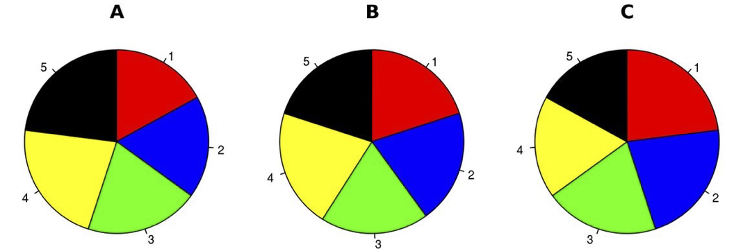
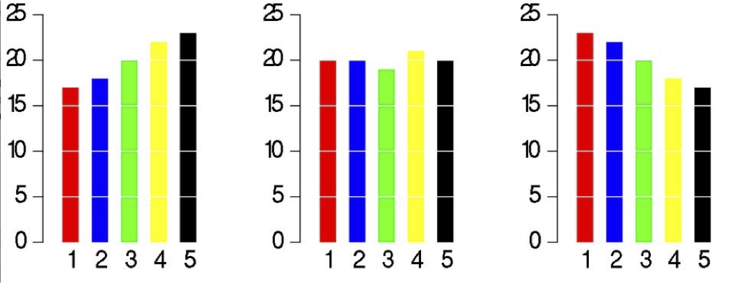
Now look at the same data when simply plotted on bar charts. The differences between the candidates and polling stations are instantly apparent.
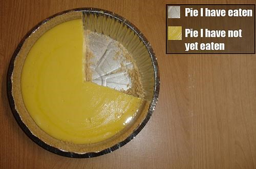
As it so happens, a pie chart is also poor for comparing between itself. For example in this chart, how much bigger is Pinot Grigio and Tempranillo?
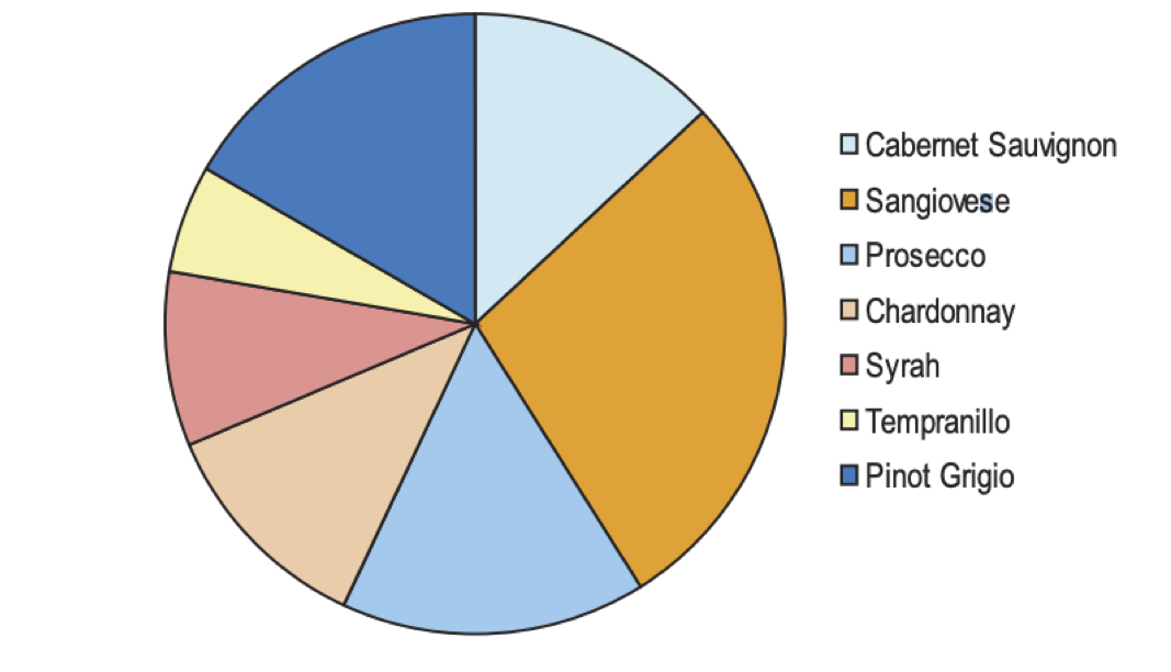
Notice that to answer my question your eyes have to move to the legend then find the corresponding pie slice in the chart. Then you had to try and compare the size of the slices accounting for their differing orientation.
Now instead compare it against a simple bar chart:
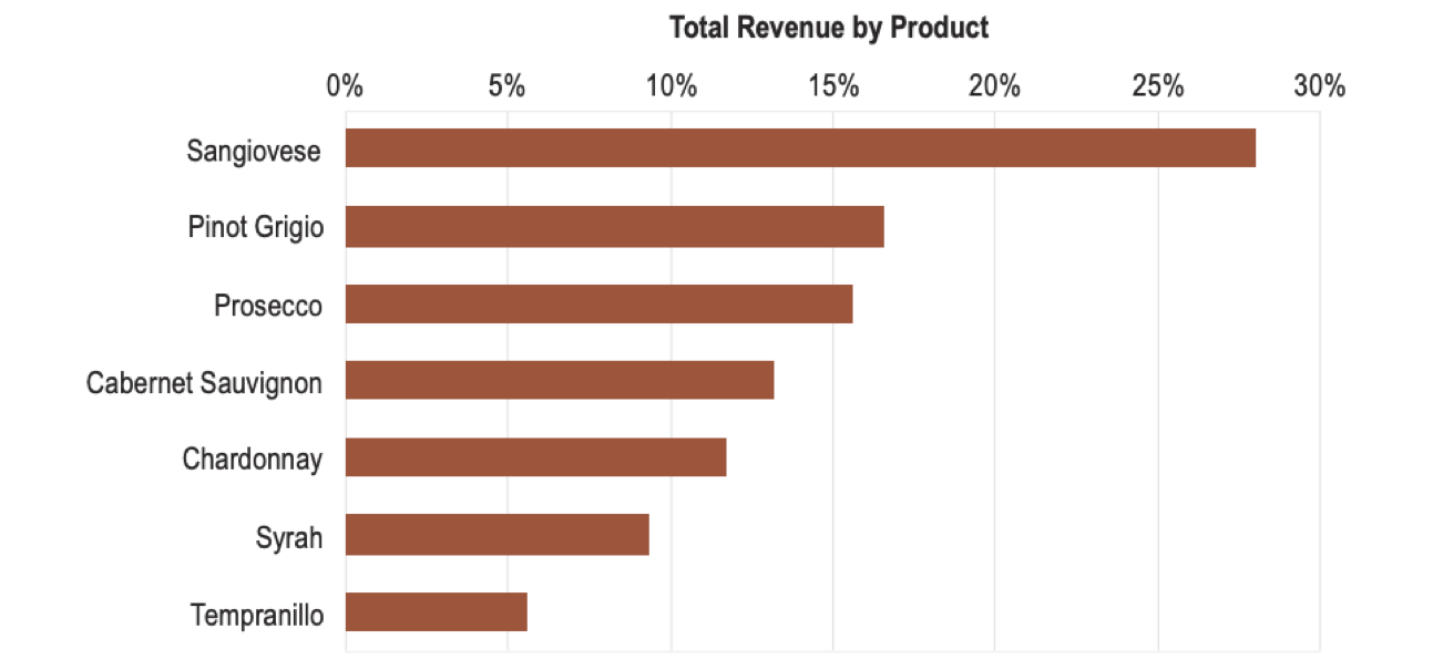
You can quickly estimate that the answer is about 3 times.
Use fonts carefully
Using the wrong font (with poor kerning- space between letters in a font) can have catastrophic, if not amusing effects.


Here are some simple rules of thumb to help you choose fonts:
- Generally Sans-serif fonts (e.g. Helvetica, Arial) are good for on-screen text.
- Serif fonts (e.g. Times, Georgia) - are good for printed text (because print often has more resolution than computer screens).
- Monospace fonts (e.g. courier) are good for when you need exact alignment of text characters (e.g. source code or numbers in tables).
- Stylish fonts are best left for party invitations.
- Lower case words are read faster than words than upper case.
- Individual letters and nonsense words like UA1138 are read faster in upper case.
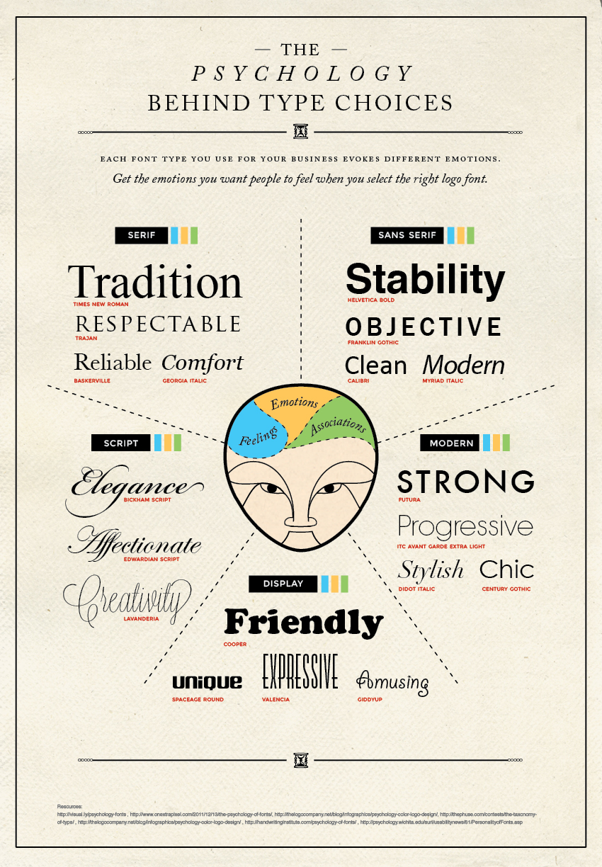
Fonts can also evoke different emotions. Here’s a brief guide:
The Process
So far I’ve given you a bunch of visualization do’s and don’ts - mainly don’ts. I did this in the hopes that you might start to develop an allergic reaction to bad visualizations. So now you’re probably wondering whether there is a magical set of steps that can guarantee good visualizations. Unfortunately no. But maybe in a few years with rapid advances in Artificial Intelligence, we can have AI learn enough to eventually replace data visualization experts. That so happens to one of my areas of research. But in the meantime, the best I can offer in this introductory workshop is a guideline of the common steps visualization experts follow to produce visualizations. And later we can also talk about contemporary visualization tools you can use.
Overall this is the general process:
- Understand your audience. Ask yourself the following questions:
- Who is the visualization for?
- What is their level of understanding of a subject? What is their education level?
- What are they trying to verify/confirm?
- What are they trying to discover?
- What questions / hypotheses are they trying to answer?
- What story are they trying to tell?
- For each of your questions, identify which attributes in the data need to be plotted to answer them.
- Each grouping of attributes could be considered 1 chart that needs to be plotted.
- On individual post-it notes, or note cards, sketch out how attributes might be visualized. Consider also how a user might interact with the visualization- e.g. turn on/off data layers, highlight data points in layers.
- Now lay out the post-it notes as a “dashboard” and also consider which ones could potentially be merged because they share data attributes.
- Make a prototype. As a prototype emerges, more questions will emerge & new charts will need to be created and/or merged until you reach the final product.
- Get feedback from your customer. Refine based on feedback.
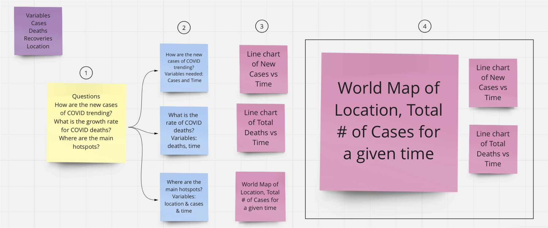
Here is an example of steps 1-4 for creating a visualization of daily cases of COVID.
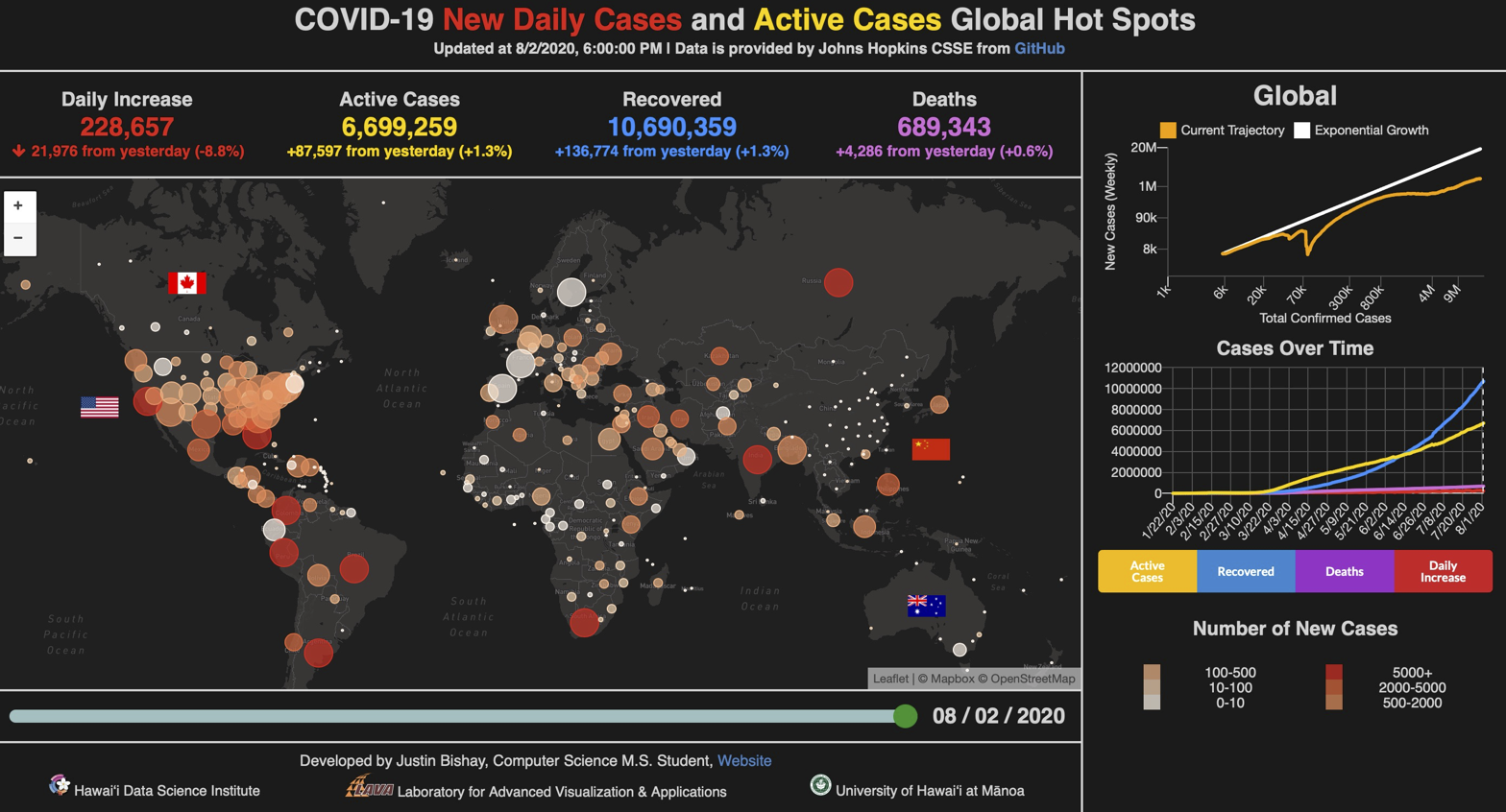
And this might be the resulting visualization after iterating over multiple versions.
Note that I glossed over step 3- the hardest part. How does one know what chart to produce?
For that there are some guides that can help get you started.
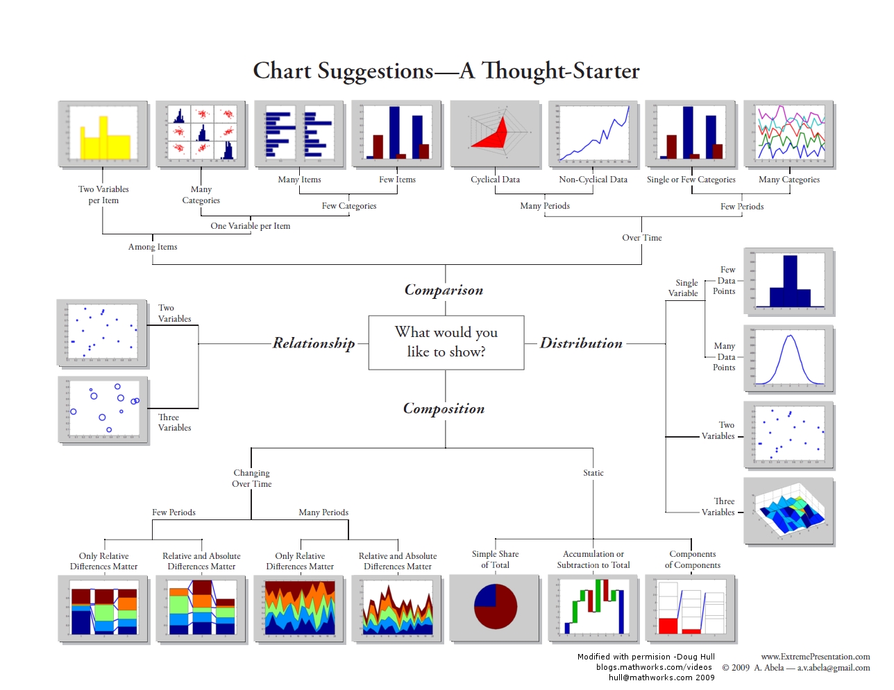
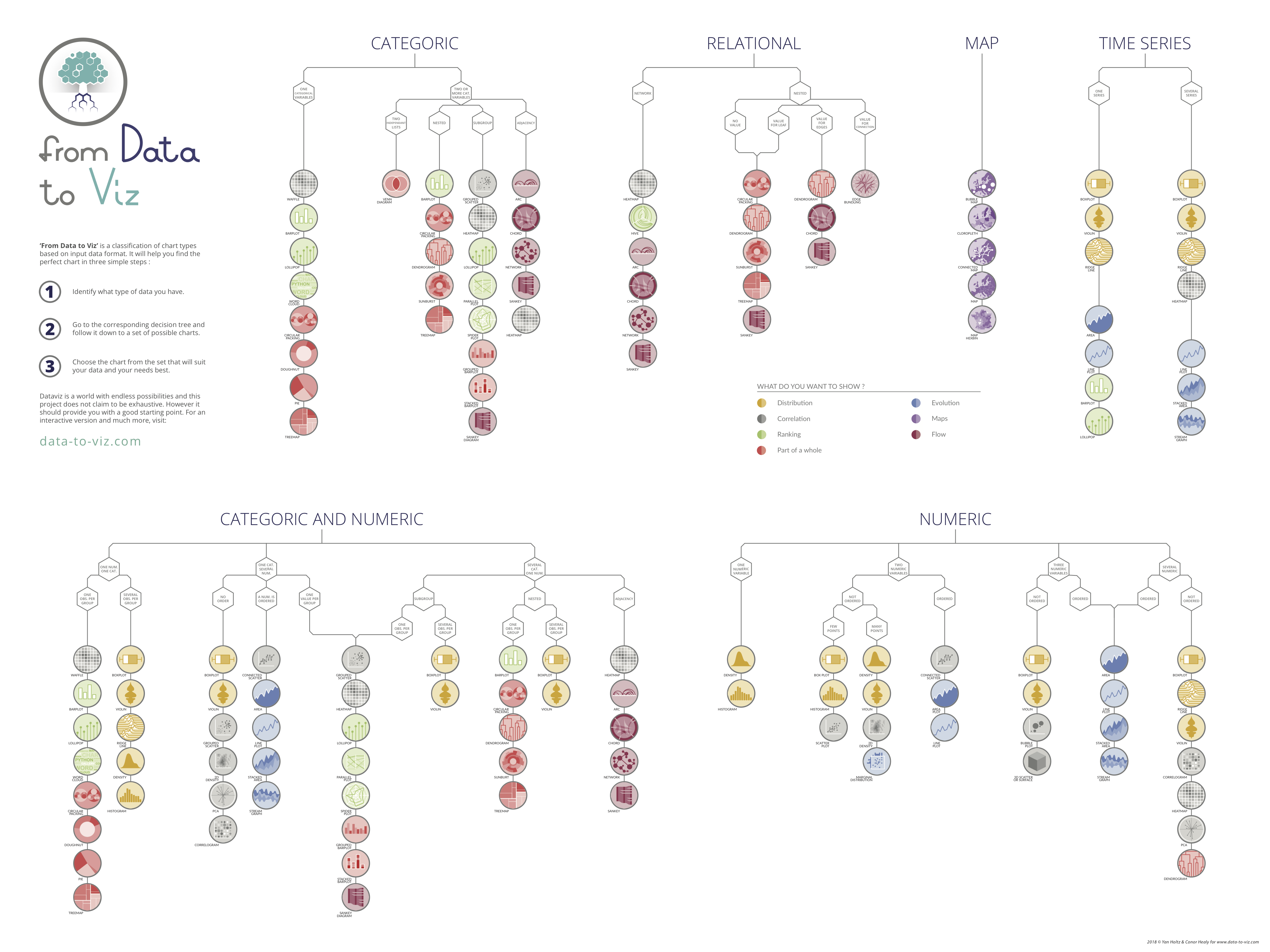
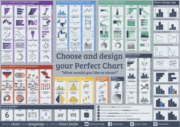
These chart guides are a good way to find existing galleries of chart types. They do not enable you to innovate new chart types such as the visualization of Napolean’s march at the beginning of this workshop, or the stunning charts found at: informationisbeautiful.net, visualcapitalist.com, visme.co - Climate Change, visme.co - best-data-visualizations.
For example here is one from Information is Beautiful about where the world’s food goes.
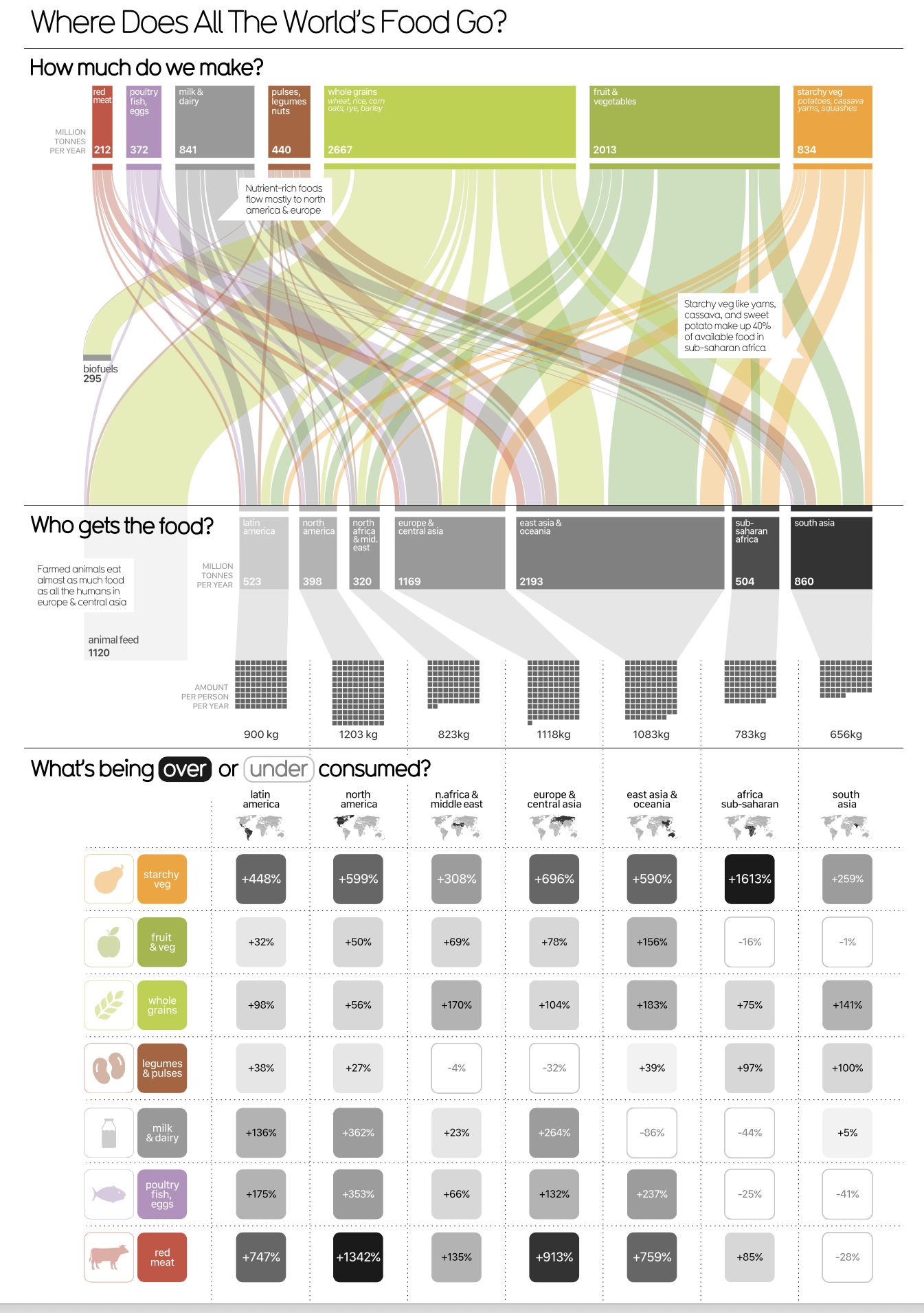
These charts are typically hand-crafted by someone with considerable graphic design and data visualization experience. I encourage you to consume a regular diet of visualizations because the more you see good visualizations, the more you’ll start to incorporate their ideas into your own practices.
A Little Deeper
Before we talk about contemporary visualization tools, let’s go a little deeper and look into how the human brain interprets visualizations and what are the most fundamental elements (visual encodings) visualization experts and graphic designers manipulate to produce visualizations.
The figure below (from Alberto Cairo’s “The Functional Art”) depicts how your brain processes visual information.
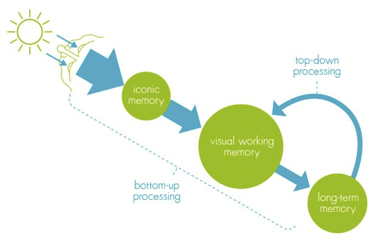
When your brain sees a visualization, it is stored in “Iconic Memory”.
Iconic Memory is a short-term buffer & processor to maintain a coherent picture of the world at all times. It also perceives basic visual attributes like shape, edges, relative size, patches of color. These visual attributes are also referred to as Pre-Attentive attributes. It means you don’t have to think hard to do it. If you know what the brain pre-attentively processes, you can use that to make important data in your visualizations stand out to the user.
Iconic memory’s information is passed to visual working memory. Visual working memory is also a short-term storage (stores about 5 +/- 2 things at a time). Lastly, long-term memory kicks in to associate things in short-term memory to enable comprehension of what you are seeing.
The goal in producing a good visualization is to:
- take advantage of pre-attentive visual attributes to make important features in the data stand out.
- not require visual working memory to hold more than 5 +/- 2 things at a time. I.e. you don’t want the user to have to refer to more than 5 encodings to make sense of something.
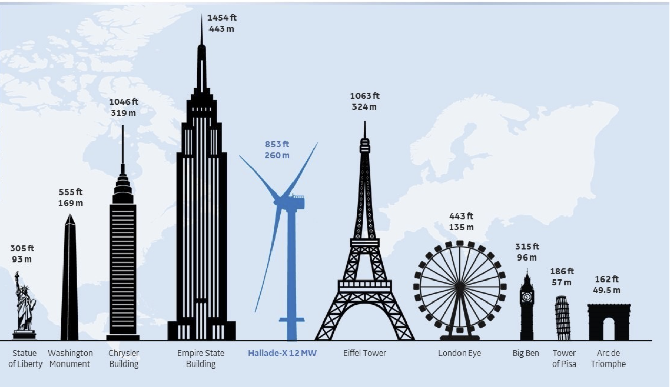
- associate it with something that the user might be familiar with from past experience (i.e. relate the data to something from their long term memory). For example, if you wanted to explain to someone that a wind turbine is 853 ft tall, compare it next to something they might know- like Diamond Head, or the Statue of Liberty, or the Empire State Building.
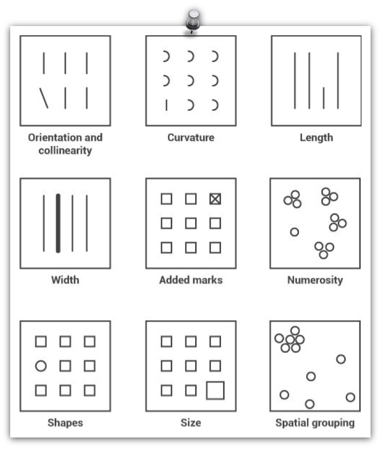
Pre-attentive visual attributes - are those that are processed in sensory memory without our conscious thought. It takes our brain less than half a second to process a pre-attentive property of an image. Four basic visual properties that can be defined as pre-attentive include: Form, Movement, Spatial Positioning and Color.
Examples of Form include: orientation, curvature, length, width, added marks, numerosity, shapes, size, and spatial grouping.
Examples of movement include: Flicker, Velocity, Direction.

Examples of Spatial Positioning include:
- 2D positioning – plotting something on a 2D map;
- Stereoscopic depth - seeing depth by virtue of the fact that we have 2 eyes. As it turns out depth perception is the most rapidly detected preattentive stimulus;
- Concave and convex positioning – being able to see whether something is concave or convex.

We often use the word Color to mean a combination of: hue, saturation and value.
- Hue refers to the origin of the colors we can see (red, green, blue, etc).
- Saturation describes the purity/vividness of a hue.
- Value describes the lightness or darkness of a hue.
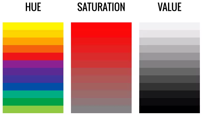
Picking the right color (hue, saturation, value) is a challenging problem for most who are inexperienced in data visualizations, however there are helpful guides available at: sciviscolor.
To Sum Up
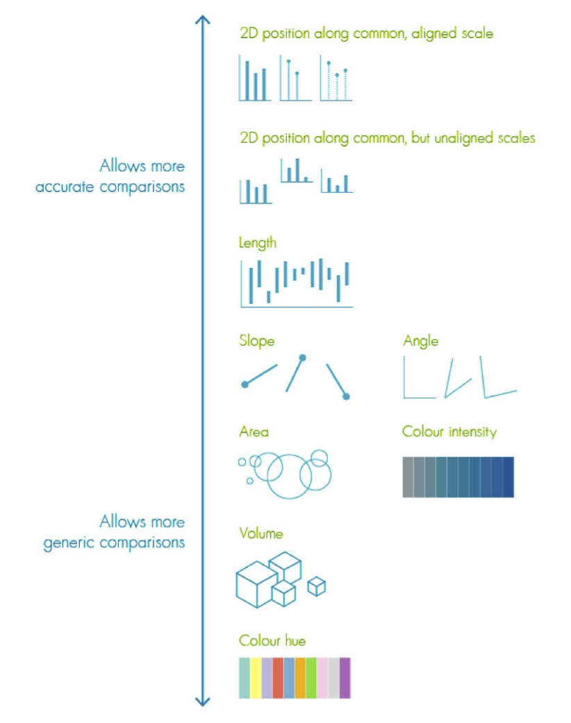
This chart below shows the relative accuracy of comparison using various visual encodings [William Cleveland and Robert McGill1984].
For color, this paper compares mean error when users view data visualizations using a variety of color mapping schemes [Bujack2017]. As summarized in the figure below, the results of the study suggests that Blue-Orange Divergent provides the most resolving power.
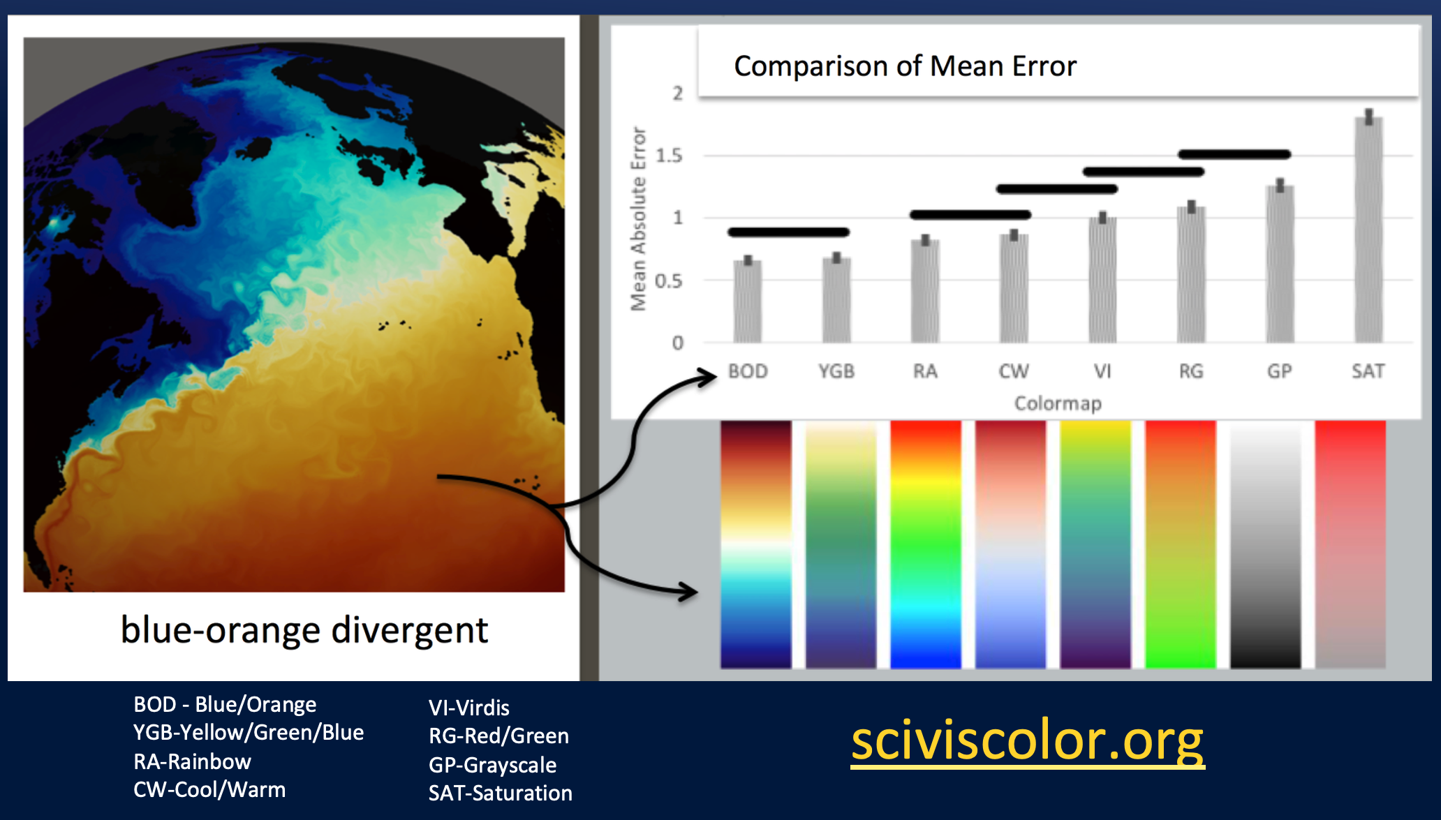
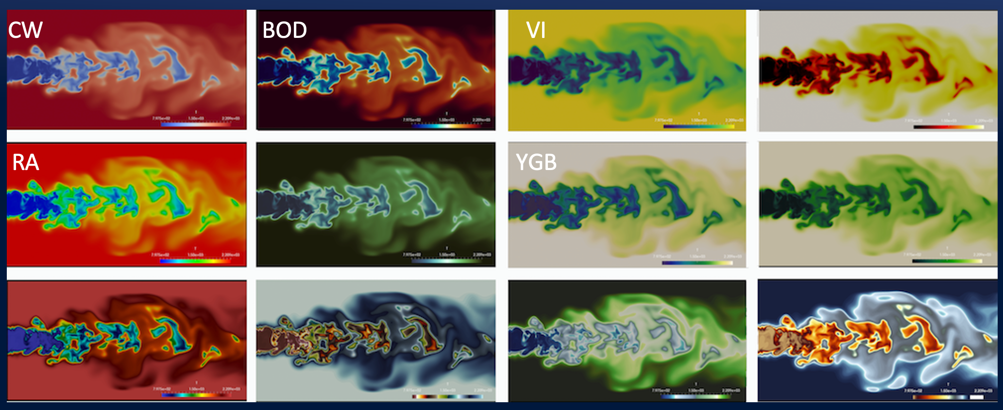
The following figure shows a combustion visualization depicted in a variety of colormaps to illustrate their respective resolving power. Many charting tools like Plot.ly, ParaView, and Tableau support most of these colormaps and also allow you to create your own. Note: the allocation of data values to colors in the colormap need not be linear. For example, if there is a large number of data points share similar values a linear scale may assign all those data points to the same color. Instead one could assign more colors to those data points to make the details easier to resolve.
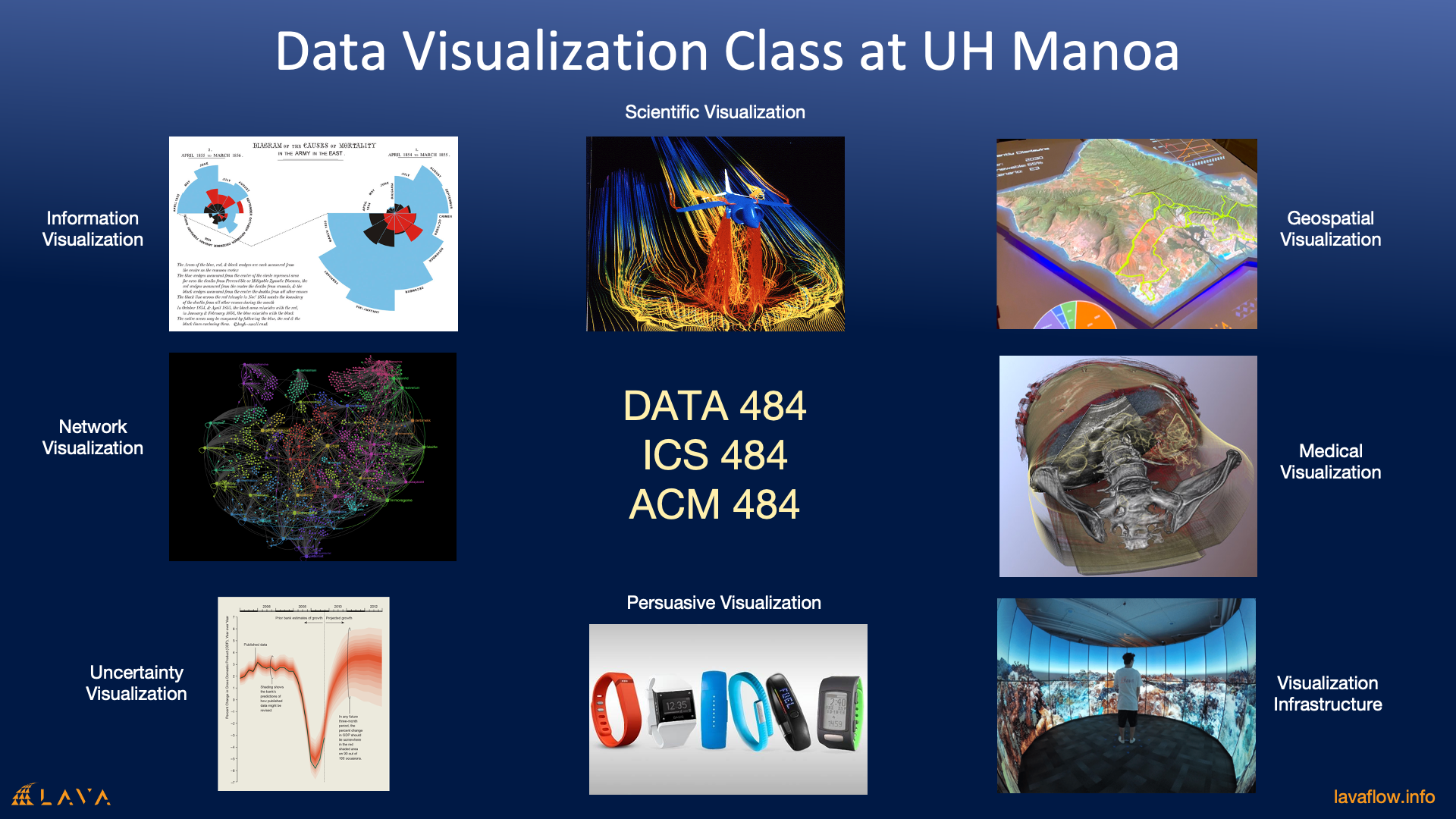
If you are interested in learning more about data visualization, the University of Hawaii at Manoa and at Hilo offers classes on the subject in the Information and Computer Sciences Department. In the next section we will introduce you to a number of popular visualization tools.
Tools of the Trade
We don’t all have time to become visualization experts so there are a number of tools that can help you get most of the job done.
The ones we are covering are: Plot.ly, ParaView and Tableau. Again since we have limited time we can only cover the very basics to get you started.
Ploy.ly
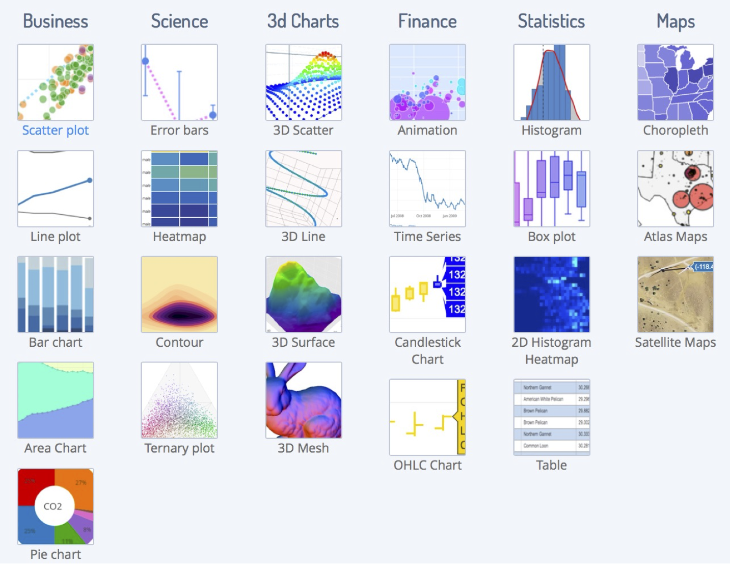
Plot.ly is a general charting library for producing statistical charts. There are numerous similar tools available (e.g. Matplotlib, Chart.js), however, plot.ly is notable because: it provides an application programming interface for Javascript, R and Python (as well as Jupyter). It also provides Chart Studio- which allows you to produce charts and simple dashboards without programming. And it provides Dash to enable you to create charts as well as fully functioning dashboards purely in Python. Lastly, Plot.ly is free and open source.
Paraview
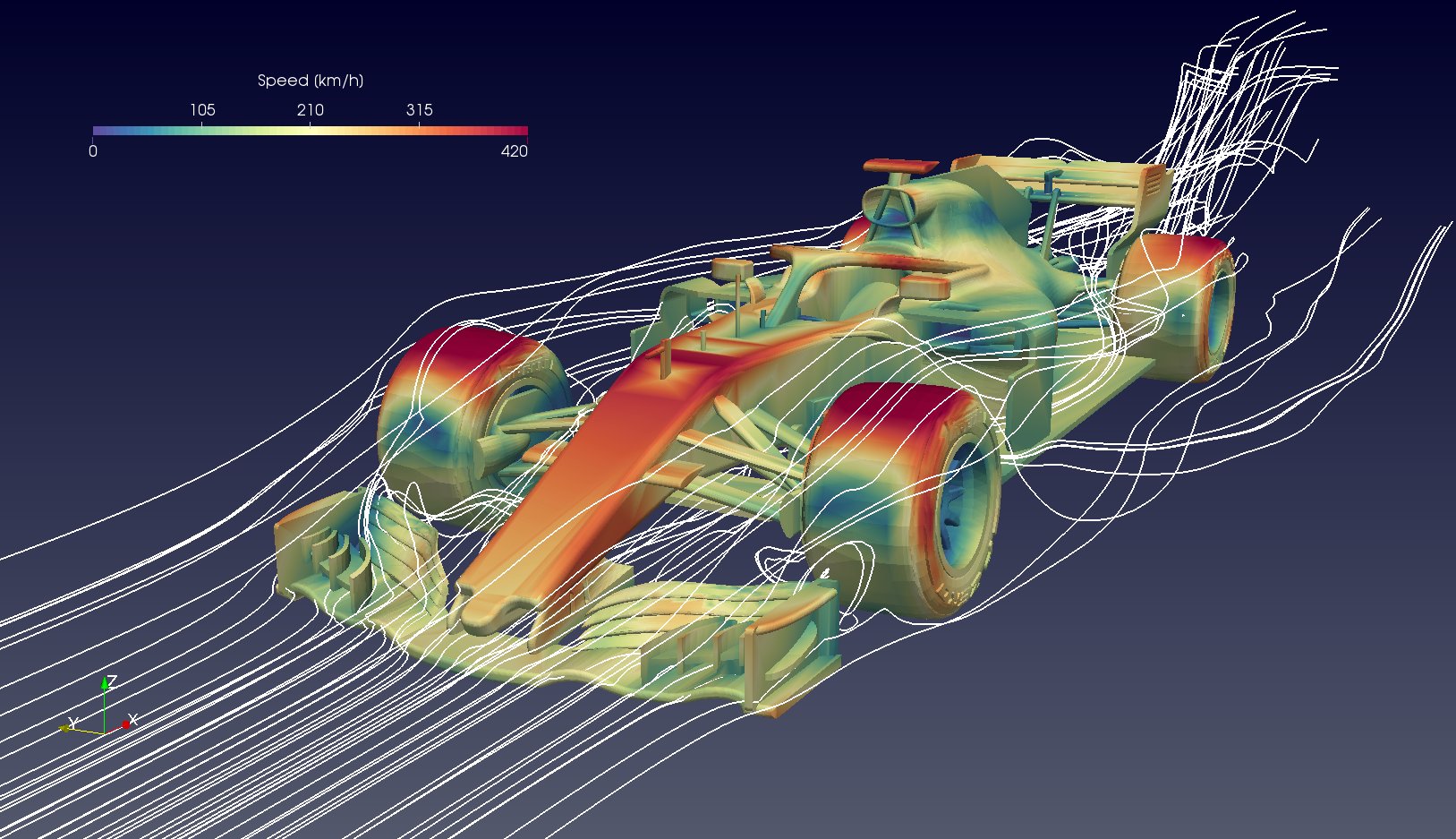
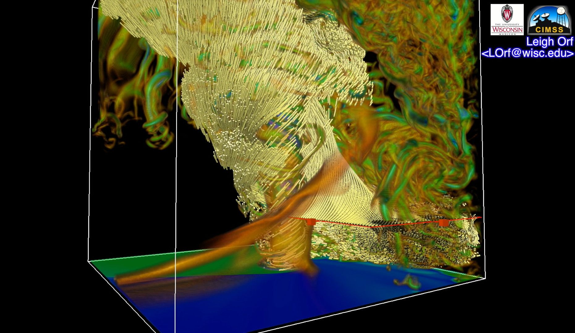
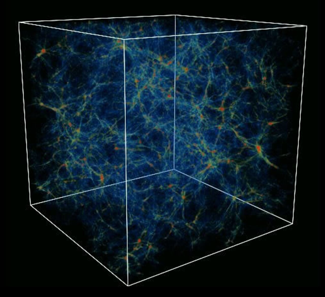
ParaView is a Scientific Visualization tool. The other major scientific visualization tool is VisIT. Scientific Visualization tools are typically used to represent data that have some form of naturalistic physical representation (e.g. visualizations of air flow around a car, tornado visualizations, visualizations of Magnetic Resonance Imaging scans from the hospital, visualizations of the formation of clusters of galaxies.) Unlike most statistical visualization tools, ParaView and VisIT can run on supercomputers/computer clusters to visualize data sets too large to run on desktop PCs. Both ParaView and VisIT are open source, and ParaView is built on top of the Visualization Toolkit (VTK)- a widely used application programming interface for producing scientific visualizations.

Tableau
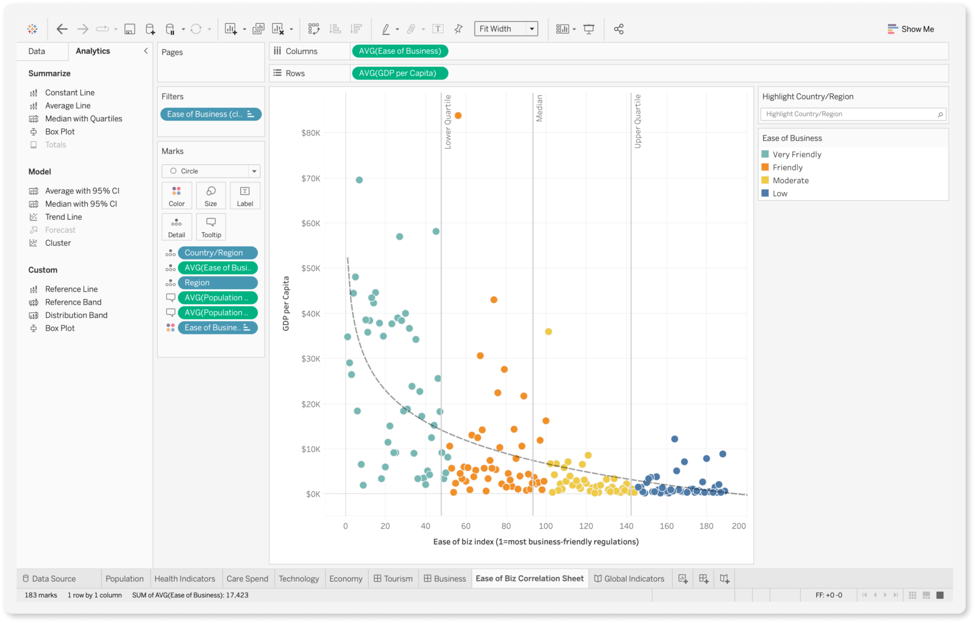
Tableau is a relatively new tool. It is also a statistical visualization tool. We are including Tableau in our workshop because it is fast becoming popular in the commercial sector. For example, First Hawaiian Bank uses Tableau. Unlike plot.ly, which has multiple use modalities (application programming interface, no-code interface), Tableau is a standalone application like Microsoft Excel. Tableau is a commercial product, so it is not free, although students and faculty can get a free annual licenses.
Lastly, for geospatial visualization (anything to do with maps), the most well known tool is ESRI’s ArcGIS. It is an commercial tool, which is free to students and faculty. Most government agencies uses ArcGIS’ suite of products.
If you prefer to use an open source tool, we recommend taking a look at QGIS. Unfortunately we will not be able to cover geospatial visualization tools in this workshop.
Just One More Visualization
Below are two visualizations produced by W.E.B. Du Bois, sociologist, author, advocate, historian, and co-founder of the NAACP. He was also the first African American to earn a doctorate (graduate studies at University of Berlin and Harvard University) and became a Professor of history, sociology, and economics at Atlanta University.
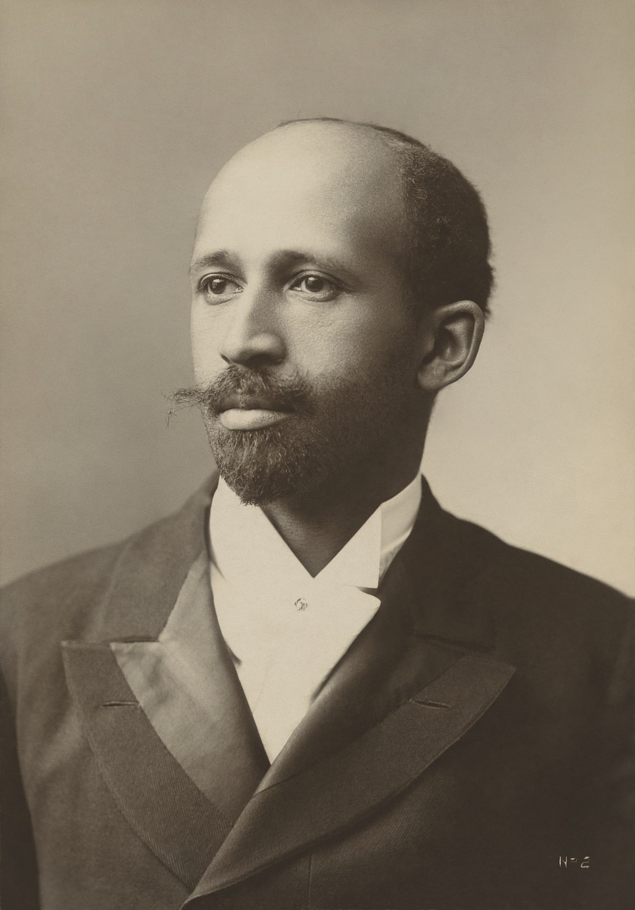
Du Bois and his students developed 63 hand-drawn diagrams for the 1900 World’s Fair to showcase the success of black Americans despite facing pervasive racism in the U.S. and globally.
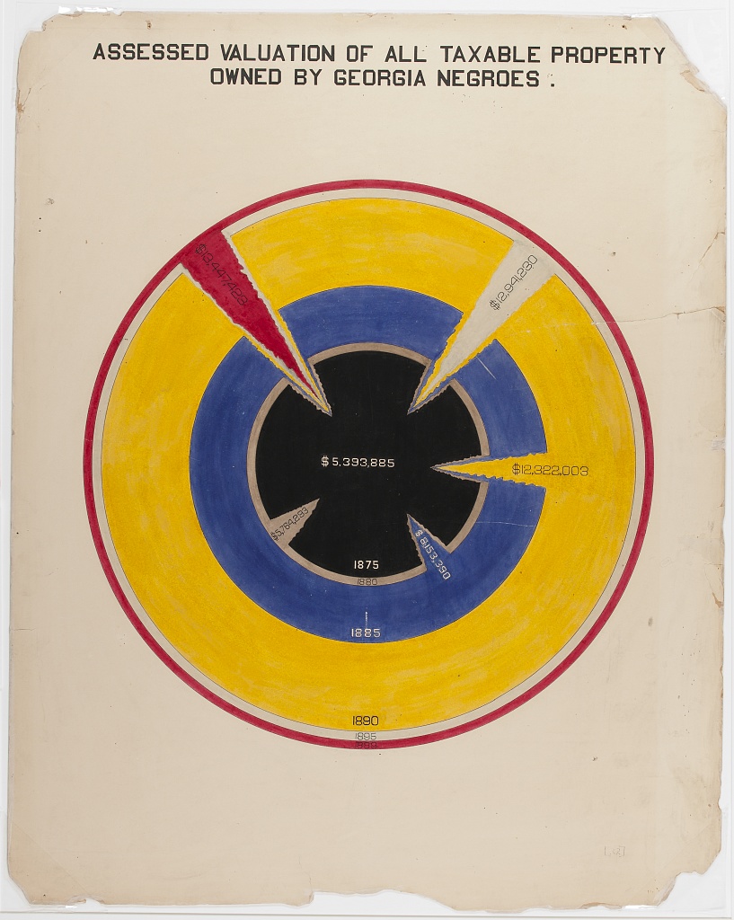
The one on the left shows the value of taxable property owned by blacks in Georgia from 1875-1800. It uses color and shape to create an optical gravity well toward the center of the image. The shards help the user understand that the outer circles extends through to the center of the circle, as well as draws viewers’ eyes towards it. Property value is represented by the differences in radii. Perhaps for more accurate depiction (to minimize visual distortion often produced when using volumes) the areas should be scaled to appropriately represent the property values instead. However the distortion may have been intentional to enhance the evocativeness of the visualization.
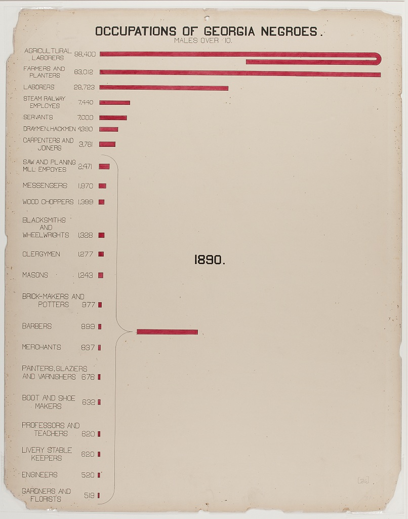
The graphic on the right shows the occupations of Georgia black males over 10. Notice the curved bar at the top. If the bar was entirely linear, proportionally the bars below it would have been 1/3 smaller and more difficult to see. Also note the summary of smaller occupations showing that, together they produce a significant contribution to overall employment.
Key Points
Data visualization isn’t something that is only done at the end of a research project, it should be used throughout. It can help find problems with the data early during the gathering process, it can help you accelerate comprehension of the data, it can help you see both scale and complexity in the data, it can help you discover unanticipated emergent features in the data, it can help you form new hypotheses, and it can help you tell more compeling stories about data.
- Data visualization is a complex field unto is itself, and producing good visualizations requires constant awareness of good as well as bad examples.
- Producing good visualizations requires effective mapping of data attributes to pre-attentively processed visual cues.
There are useful guidelines that one can use to select appropriate charts and visual encodings, and there are tools that will help you create those charts. However, the creation of novel forms of visualization is as much science as it is craft.